
How to Build an Innovation Dashboard: A Step-by-Step Guide15 min read
Most companies want to be more innovative, but they run into a common problem: it’s hard to measure.
Innovation can feel chaotic and uncertain, making it difficult to track progress, justify spending, and connect projects to company goals.
An innovation dashboard is the solution.
It’s a central place to see how your innovation efforts are performing. Think of it as a control panel that turns scattered data into a clear story about what’s working and what isn’t.
It helps you manage your innovation program with the same focus you apply to other parts of your business.
Why You Need an Innovation Dashboard
An innovation dashboard helps you:
- Make better decisions: It turns abstract data into an interactive tool for making faster, more informed choices.
- Create strategic clarity: The process forces you to define clear goals, turning vague ambitions into measurable outcomes.
- Build a data-driven culture: It provides transparency, helps you celebrate wins, and allows your team to learn from failures.
An effective dashboard is a core part of a successful innovation program that provides clarity and strengthens your company culture.
It transforms innovation from an abstract idea into a manageable process by allowing you to monitor progress and spot trends.
The process of building a dashboard forces your organization to define its strategic goals, which helps get everyone aligned.
By making performance visible, the dashboard also creates accountability and helps communicate the value of your work.
Choosing the Right KPIs for Your Dashboard
The core of your dashboard is its Key Performance Indicators (KPIs).
But innovation is not a standard business operation. It’s a process of discovery, full of experiments and wrong turns.
Applying rigid financial metrics too early can punish creativity and kill promising ideas. The key is to choose a balanced set of metrics that tell the whole story.
The Problem with Measuring the “Unknown”
Traditional business KPIs are great for monitoring predictable processes, but innovation is anything but.
The metrics you choose must:
- Fit your company’s specific goals
- The type of innovation you’re pursuing (small improvements or big breakthroughs)
- The maturity of your program
Copying another company’s KPIs is a common mistake that rarely works.
To get a complete picture, your dashboard should include a mix of metrics across five categories.
This is like a balanced scorecard for innovation, measuring not just the final results, but also the health of the system that produces them.
| KPI Category | What It Measures | Example KPIs |
|---|---|---|
| Input | Resources and commitment | R&D Spending, Employee Time on Innovation |
| Process | Pipeline efficiency and speed | Idea Conversion Rate, Time-to-Market |
| Output | Tangible results of activities | New Products Launched, Patents Filed |
| Outcome | Business and financial impact | % Revenue from New Products, ROI² |
| Cultural | Health of the innovation ecosystem | Employee Participation Rate, Survey Scores |
1. Input Metrics: Tracking Your Commitment
These metrics show how many resources your company dedicates to innovation. They’re leading indicators of your commitment.
Here are some common examples:
- R&D Spending as a % of Revenue: The classic metric for reinvestment in future growth.
- Total Investment in Innovation: A broader measure including labs, idea platforms, and training.
- % of Employee Time on Innovation: Shows how much human capital is focused on new ideas.
- Number of Employees Trained: Tracks the growth of innovation skills in your workforce.
These metrics are very important for new innovation programs because they demonstrate strategic intent to leadership.
They help justify budgets by showing that resources are being actively deployed against innovation goals.
Tracking inputs sets a clear baseline for performance before you can expect to see significant outputs or outcomes.
2. Process Metrics: Measuring Your Speed and Efficiency
These track the health and speed of your innovation pipeline. Key process metrics to track include:
- Idea Conversion Rate: The percentage of ideas that make it from submission to launch.
- Time-to-Market: The average time from idea approval to public launch.
- Time-to-Prototype: How quickly concepts are turned into testable artifacts.
- Product Kill Rate: The percentage of projects stopped at different stages (a healthy kill rate shows you’re good at redirecting resources away from unpromising ideas).
Process metrics help you identify bottlenecks and diagnose the health of your innovation engine.
They show whether your teams are agile and efficient in moving ideas through the development stages.
A dashboard with strong process metrics proves that your innovation program is a well-run operation, not just a series of random activities.
3. Output Metrics: Quantifying Your Activities
These are the direct, tangible results of your innovation activities. Common output metrics include:
- Number of New Ideas Generated: Measures the volume of creative input.
- Number of New Products Launched: A simple count of tangible outputs.
- Number of Patents Filed: Tracks intellectual property generation.
- Number of External Partnerships Formed: Shows progress in building an open innovation ecosystem.
While these metrics don’t measure business impact on their own, they’re needed for tracking momentum.
They provide tangible evidence that the inputs and processes are producing real things.
This helps keep teams motivated and shows stakeholders that the innovation pipeline is active and productive.
4. Outcome/Impact Metrics: Measuring Real Business Value
These are the key lagging indicators that measure financial and business success.
To measure true business value, consider tracking outcome metrics like these:
- % of Revenue from New Products: Directly measures the commercial impact of innovation.
- Return on Innovation Investment (ROI²): The financial return from money spent on innovation.
- Cost Savings from Process Innovations: The bottom-line impact of efficiency improvements.
- Market Share Growth: Tracks the competitive impact of new products.
These are the metrics your executive team cares about most, as they connect innovation directly to the company’s bottom line.
They answer the final question: “Are our innovation investments creating value?”
Proving a positive impact with these KPIs is the best way to secure long-term support and increased investment for your programs.
5. Cultural Metrics: Gauging the Health of Your Team
These metrics measure the health of your innovation culture. Examples of cultural metrics include:
- Employee Participation Rate: The percentage of your workforce involved in innovation programs.
- Diversity of Contributors: Tracks participation across departments, levels, and locations.
- Employee Perception of Innovation: Measures sentiment through pulse surveys.
A healthy culture is the soil from which all innovation grows, making these metrics foundational.
They can act as an early warning system, diagnosing issues with engagement or psychological safety before they hurt project outcomes.
Tracking cultural health shows you are building a sustainable capability for innovation, not just chasing short-term wins.
Designing Your Dashboard for the Right Audience
A dashboard that no one uses is a failure.
To make sure your dashboard is effective, you have to design it for the people who will be using it (a one-size-fits-all approach leads to a cluttered and confusing tool).
Who are you building this for?
First, identify your key audiences. Their goals and needs will determine what information they see.
The three main groups are:
- Executive Leadership (CEO, Board): They need a high-level, strategic view to see if innovation is creating long-term value.
- Innovation Managers (CINO, R&D Heads): They need a tactical view to manage the portfolio, allocate resources, and track progress.
- Project Teams: They need an operational view to see their immediate tasks and how their work contributes to the bigger picture.
Each audience needs a different dashboard view with different KPIs.
| Audience | Dashboard Type | Key Question | Example KPIs |
|---|---|---|---|
| Executives | Strategic | Is innovation driving growth? | ROI², % Revenue from New Products |
| Managers | Tactical | Is our pipeline healthy? | Pipeline Velocity, Time-to-Market |
| Teams | Operational | What are our priorities today? | Task Completion Rates, Upcoming Milestones |
The best way to get your dashboard used is to build it with your stakeholders, not just for them.
When you involve a business unit leader in choosing the KPIs that matter to their division, they become a partner in its success.
The dashboard stops being a top-down reporting tool and becomes a shared instrument for achieving goals.
How to Build Your Dashboard in 6 Steps
With a clear understanding of your strategy, metrics, and audience, you can start building.
Following a structured process will help you create a tool that is both technically sound and strategically useful.
Step 1: Define Your Purpose and Goals
To make sure your dashboard is built on a solid strategic footing, focus on these key actions:
- Agree on the purpose: Get key stakeholders to agree on why the dashboard exists.
- Define decisions: Clarify what specific decisions the dashboard will help people make.
- Encourage behaviors: Identify the behaviors you want to encourage, such as risk-taking or collaboration.
- Set SMART goals: Translate vague ambitions into specific, measurable, achievable, relevant, and time-bound goals.
Getting this right prevents you from building a technically perfect dashboard that nobody uses because it doesn’t answer the right questions.
A clear purpose acts as a north star for every subsequent design and development decision. This initial alignment is a decisive step in creating a tool that provides real value.
Step 2: Select KPIs and Find Your Data
With clear goals, you can now select a balanced set of KPIs to measure progress. For each KPI you choose, you must identify where the data comes from.
Common data sources include:
- Innovation Management Software (e.g., Accept Mission)
- Financial/ERP Systems
- Project Management Tools (e.g., Jira, Asana)
- CRM Systems (e.g., Salesforce)
- HR Information Systems
This step is a key check for data integrity and feasibility before you start building.
Identifying the single source of truth for each metric help confirm that everyone is working from the same, trustworthy information.
This data mapping exercise also helps you spot any gaps where you might need to create new ways to capture important information.
Step 3: Design an Intuitive Layout
To create a great dashboard that tells a story, follow these design principles:
- Guide the user’s eye: Place the most critical KPI in the top-left corner, where users naturally look first.
- Emphasize key numbers: Use size, color, and bold fonts to make the most important metrics stand out.
- Group related metrics: Use visual containers and whitespace to create a logical flow and reduce clutter.
- Choose the right chart: Use line charts for trends, bar charts for comparisons, and tables for precise values.
A thoughtful design turns a confusing collection of charts into a compelling data story.
The goal is to reduce cognitive load, allowing users to grasp the key takeaways in five seconds or less.
This focus on user experience is what makes a dashboard not just informative, but truly useful.
Step 4: Develop the Dashboard and Connect Your Data
In this technical phase, bringing the dashboard to life involves three main tasks:
- Connect to data sources: Establish the connections to the databases, APIs, or files identified in Step 2.
- Clean and shape data: Use ETL (Extract, Transform, Load) processes to make certain data is accurate and structured correctly.
- Set refresh rates: Configure how often the data updates, from near real-time for operational teams to daily for executives.
This is where the design blueprint becomes a functional tool.
The quality of your ETL process is a key part of making sure the data powering your visuals is reliable and accurate.
Setting appropriate data refresh rates helps different audiences get information at a speed that matches their decision-making needs.
Step 5: Make it Interactive
To transform your dashboard from a static report into a tool for exploration, include these interactive elements:
- Filters and Slicers: Allow users to segment data by date range, business unit, or project type.
- Drill-Downs: Let users click on a high-level number to see the details behind it.
- Tooltips: Provide more information when a user hovers over a data point.
Interactivity is what transforms a dashboard from a static picture into a dynamic tool for discovery.
By empowering users to ask and answer their own questions, you encourage a more curious and data-literate culture.
These features increase engagement and help the dashboard remain relevant to a wider range of user needs.
Step 6: Test, Get Feedback, and Improve
To treat your dashboard like a product that evolves, establish a continuous improvement cycle with these activities:
- Test thoroughly: Before launching, check for data accuracy, functionality, and performance.
- Gather user feedback: Ask users what’s missing, what’s confusing, and if it helps them make better decisions.
- Iterate continuously: Use feedback to make regular updates, making sure the dashboard remains a valuable and relevant tool.
A dashboard is a product, not a one-time project, and it requires a cycle of continuous improvement.
Gathering direct feedback from end-users is the most effective way to understand what’s working and what isn’t.
This iterative process confirms the dashboard evolves with the business and continues to deliver value long after its initial launch.
Choosing the Right Tools and Technology
The technology you choose to power your dashboard is a key decision.
Your options range from flexible, general-purpose Business Intelligence (BI) tools to the specialized dashboards built into Innovation Management Software (IMS).
Business Intelligence (BI) Tools
BI tools (e.g., Power BI, Tableau) are extremely powerful and flexible.
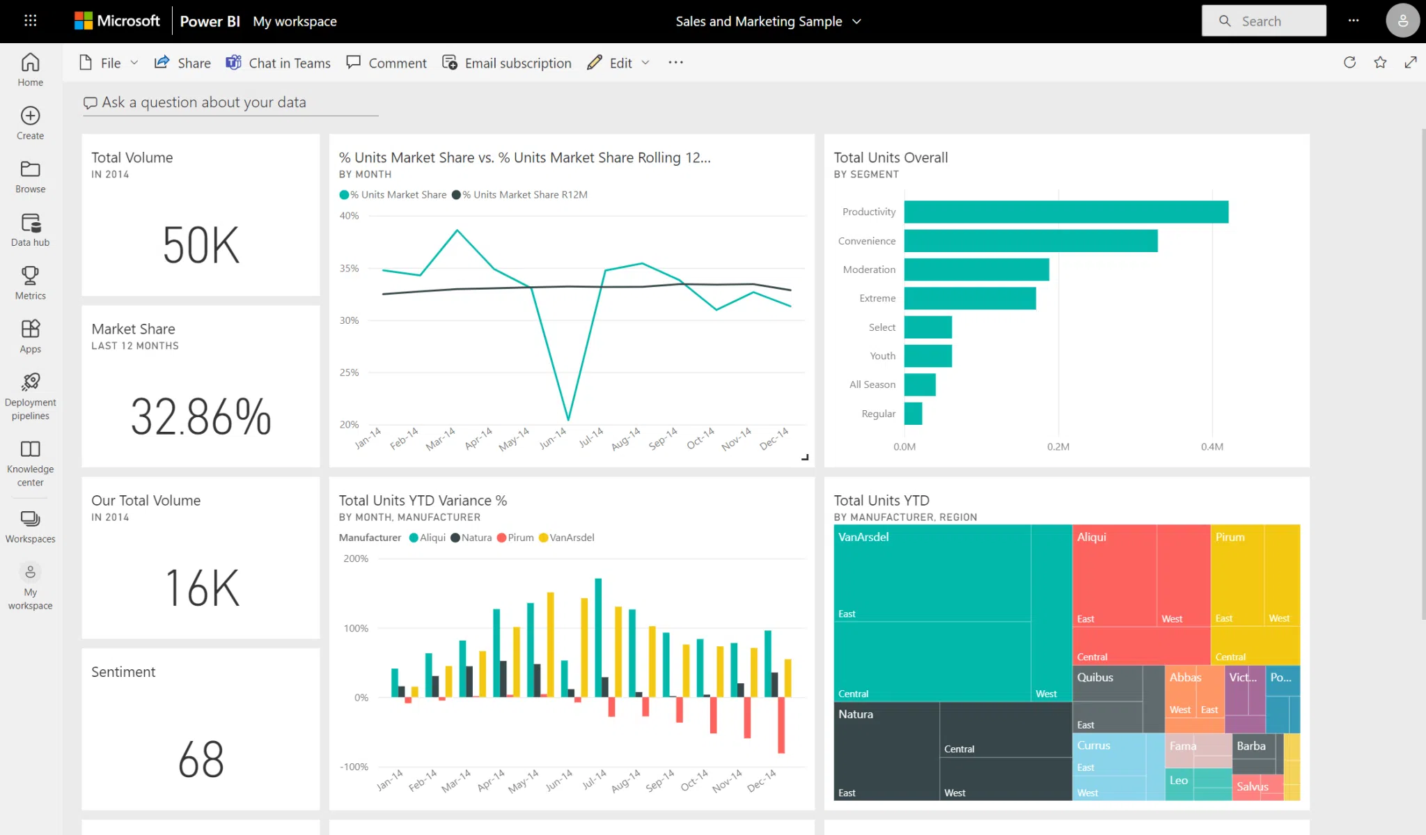
They can connect to hundreds of different data sources, allowing you to create a single dashboard that combines innovation data with financial, sales, and operational data.
However, they have a steep learning curve and require significant setup time.
For example, a company could:
- Use Power BI to pull project cost data from its SAP financial system
- Connect to Jira to track development timelines
- Import a spreadsheet of idea submissions
They can build a custom dashboard that calculates ROI² and visualizes the process from idea to market.
Integrated Platform Dashboards
IMS dashboards (e.g., Accept Mission) are purpose-built for innovation. They come with pre-configured KPIs and are ready to use out of the box.

They’re intuitive and easy to deploy, but they offer less customization and struggle to pull in data from outside the platform.
For example, an innovation manager could:
- Log into their IMS
- Immediately see a pre-built dashboard
- Sees the number of active innovation campaigns and the idea conversion rate for each
- A leaderboard of the most engaged employees
This provides instant visibility into the health of the innovation program without requiring any custom development or data integration work.
The Hybrid Approach: Getting the Best of Both
For many organizations, the best solution is a hybrid approach
Use an IMS as the main system for your innovation activities, then connect it to a BI tool for advanced reporting.
This gives you the context-rich data from the IMS and the analytical power of the BI tool.
| Criterion | Standalone BI Tools | Integrated IMS Dashboards |
|---|---|---|
| Flexibility | Very High | Low to Moderate |
| Speed to Deploy | Slower | Faster |
| Data Connectivity | Very High | Low |
| User Skill | Moderate to High | Low |
A Note on Gamification (The Accept Mission Example)
Some modern platforms use gamification to drive engagement, which can produce unique data for your dashboard.
For example, Accept Mission frames innovation campaigns as “missions.”
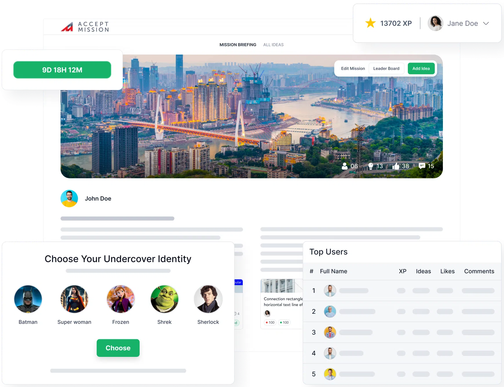
This allows you to track novel cultural metrics like “Mission Acceptance Rate” or even a “Psychological Safety Index” based on the volume of anonymous idea submissions.
This data can provide a much deeper look into the health of your innovation culture.
Common Mistakes to Avoid
Many dashboard projects fail to deliver on their promise. Here are a few common pitfalls to watch out for.
1. The “Kitchen Sink” Dashboard (Too Much Data)
This is the most common mistake. It’s the attempt to cram every possible metric onto a single screen.
This creates information overload and makes it impossible to see the signals through the noise. A good dashboard is focused. Less is more.
2. The “Vanity Metrics” Dashboard (Wrong Data)
This dashboard focuses on metrics that look good but don’t measure real business impact.
For example, celebrating the “number of ideas generated” without measuring their quality or conversion rate is a vanity metric. It measures activity, not achievement.
3. The “Context-Free” Dashboard (Useless Data)
This dashboard presents numbers without the context needed to understand them.
A number like “42 new ideas” is meaningless on its own.
Is that good or bad? Compared to what? Always include targets, historical trends, or benchmarks to give your data meaning.
Your Dashboard is a Living Tool
An effective innovation dashboard is far more than a set of charts. It’s a strategic tool that reflects your goals, communicates progress, and helps shape your culture.
It’s not a one-time project, but a living product that should evolve as your strategy and organization change.
By building it with your audience in mind and committing to continuous improvement, you can create a powerful instrument to guide your company toward a more innovative future.
Ready to see how a purpose-built platform can power your innovation dashboard? Book a demo with Accept Mission today to get started.









 English
 Dutch
Dutch Portuguese
 Spanish
 French
 German
 Arabic