
Dashboard Design for Innovation: Turn Activity Into Decisions9 min read

The dashboard is full, submissions are climbing, projects line the pipeline, and active initiatives sprawl across every stage.
Before every portfolio review, the same three questions go unanswered:
- Which projects deserve more resources?
- Which ones should be killed?
- Where is the real bottleneck?
A visibility dashboard records what happened.
A decision-support dashboard surfaces what to do next. Most innovation dashboards are built for the first job, and portfolio decisions suffer for it.
The Problem With Activity-First Dashboards
Most innovation dashboards track metrics that feel productive but don’t drive action. The usual suspects:
- Ideas submitted
- Workshops held
- Hackathons run
- Budget spent
- Headcount allocated
Only 22% of companies effectively track innovation performance through meaningful metrics. The rest are just counting activity.
Activity tracking and outcome tracking are not the same thing. Progress is measured in implemented ideas, business impact, and resources redirected toward higher-value initiatives.
These metrics comfort stakeholders with the appearance of a functioning system. Structural problems stay hidden until they’re too big to ignore.
Activity-first dashboards fail for four consistent reasons:
- Lack of user value: Metrics don’t answer the decisions that stakeholders actually need to make.
- Data inaccuracy: Portfolio data falls out of sync quickly, rendering dashboards unreliable.
- Unintended negative consequences: Vanity metrics incentivize the wrong behaviors (quantity over quality, volume over impact).
- Sustainability challenges: Dashboards are built and then abandoned because they don’t adapt to how teams actually work.
What innovation leaders need is better signal, not more data. The distinction is everything.
What Decision-Support Dashboards Actually Show
A decision-support dashboard is organized around the questions that matter. Not “what’s in the pipeline” but “what should we decide on next.”
Every innovation leader, when opening the dashboard before a portfolio review, is really asking three questions:
- What ideas or projects are ready to advance? Which ones have cleared evaluation, scored well, and earned a green light?
- Where are resources being wasted or misallocated? Which projects are consuming disproportionate effort without proportionate return?
- Where is the bottleneck in the pipeline? At which stage are ideas piling up, and why?
A decision-support dashboard answers these three questions with immediate clarity. Not by adding more data, but by surfacing the right signal.
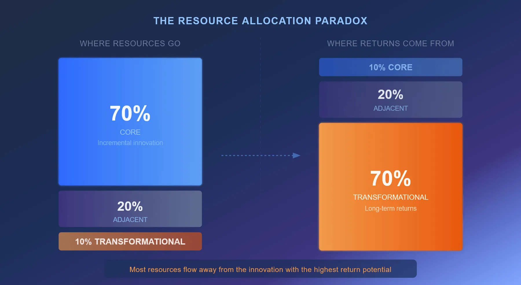
Organizations allocate 70% of their resources to core innovations, expecting steady returns. Yet transformational initiatives, which receive only 10% of resources, generate 70% of long-term returns.
Without dashboard visibility, this imbalance stays invisible. Activity-first dashboards reinforce it. Structure and transparency across the portfolio is what corrects it.
A well-designed innovation dashboard surfaces the information that review cycles actually need:
- Which projects are bottlenecked
- Which are scoring high and ready to advance
- Which are duplicating effort elsewhere in the portfolio
- Which deserve a resource increase or decrease
That transparency feeds better decisions at every cycle.
Organizations that establish this kind of structure report measurable time savings in managing ideas and projects, driven by centralized overviews, structured workflows, and automated reporting.
Design Principles That Drive Decisions
Knowing what a decision-support dashboard should do is one thing. Building one that actually delivers it is another.
These principles separate dashboards that get used from dashboards that get ignored:
Match Metrics to Decision-Makers, Not to Stages
One dashboard doesn’t serve all stakeholders equally. Each role needs a different view, with a different set of questions answered.
| Role | What They Need to See |
|---|---|
| Unit-level managers | Pipeline status, bottlenecks, stalled projects (specific to their unit, with drill-down) |
| Portfolio leads | Comparative views across units: velocity, duplication, portfolio balance by innovation type |
| Executives | Trend data on time-to-market, business unit advancement rates, ROI distribution across the portfolio |
Role-based customization isn’t optional. It’s what separates signal from noise for each stakeholder level.
Without it, innovation managers drown in company-level trends that don’t inform their decisions, while executives miss the bottlenecks developing in unit-level pipelines.
Separate Leading Indicators From Lagging Ones
Not all metrics are created equal. Leading indicators predict future outcomes. Lagging indicators report what already happened.
Most innovation dashboards conflate them, creating a false sense that the system is working because lagging metrics look good.
| Leading Indicators | Lagging Indicators |
|---|---|
| Project velocity (time from submission to decision) | Financial impact (revenue from implemented ideas) |
| Pipeline balance (core vs. adjacent vs. transformational allocation) | Time-to-market (calendar days to full deployment) |
| Evaluation completion rate (decisions made per week) | Project success rate (% of launched initiatives that hit targets) |
| Scoring progress (% of portfolio assessed against criteria) | Customer adoption rate (uptake by intended users) |
| Idea-to-prototype conversion (% advancing through gates) | Market share impact (competitive positioning shifts) |
The critical mistake is building a dashboard that emphasizes lagging indicators.
By the time a lagging indicator registers (we’ve only implemented 30% of our ideas), the decision window has already closed.
You can’t speed up time-to-market by looking at the time-to-market dashboard after the project has already stalled at evaluation.
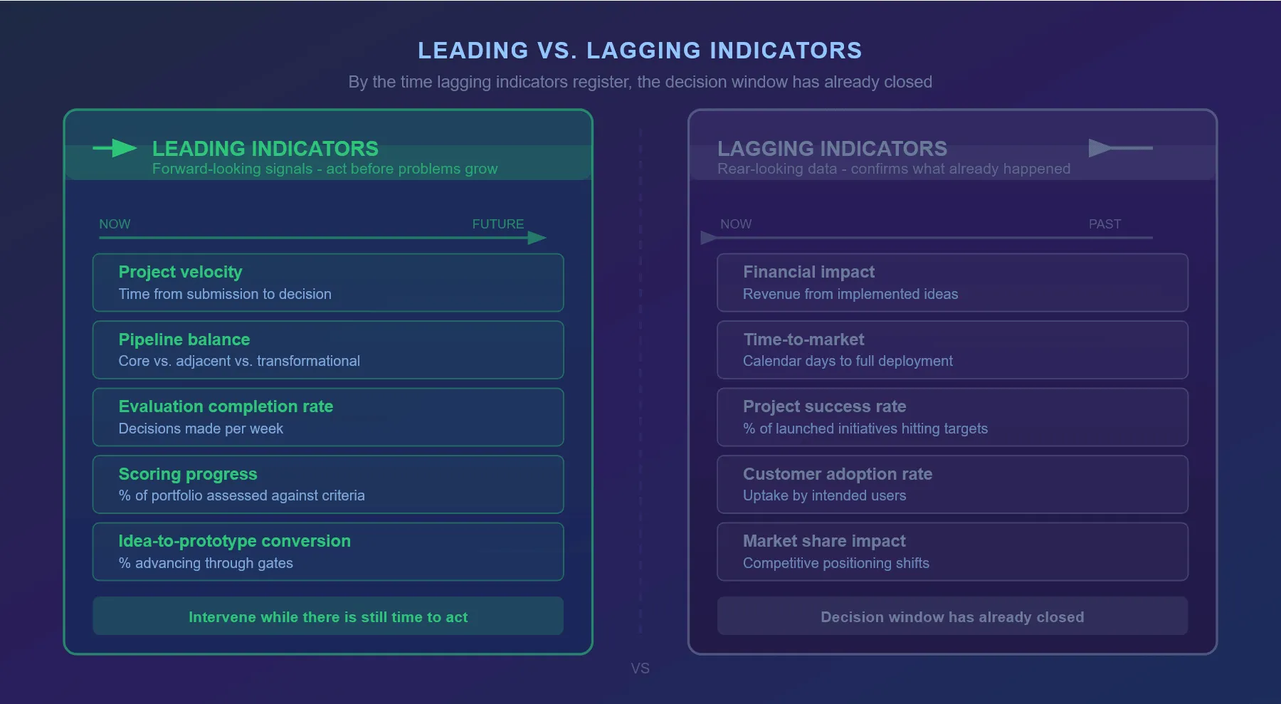
Leading indicators give you real-time visibility into whether the system is flowing. If evaluation completion rates are dropping, ideas are piling up at scoring.
If pipeline balance is skewing too heavily toward core innovation, transformational projects aren’t getting airtime. These signals let you intervene before lagging indicators deteriorate.
The Bottleneck Trap: Why Pipelines Stall Before Anyone Notices
The most common portfolio failure mode is silent.
Ideas arrive and projects move through early stages, but they often back up in the middle of the funnel for months before anyone notices.
A visibility dashboard eventually reports this. A decision-support dashboard surfaces it while the slowdown is still small and fixable.
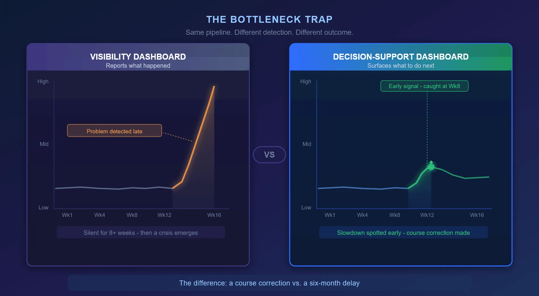
That’s the difference between a course correction and a six-month delay.
Resolving bottlenecks requires a systematic approach. Most high-performing innovation organizations follow a four-stage portfolio review process:
- Translate strategic objectives into evaluation criteria: What does “winning” mean for each innovation type? Core innovations need different criteria than transformational ones.
- Assess portfolio balance: Are we allocating resources proportionally to our strategy? Or is one type of innovation hoarding resources?
- Prioritize initiatives: Which projects rise to the top given current resources and strategic focus?
- Manage project lifecycles: Which initiatives should we accelerate, which should we sunset, which need resource increases?
This process only works if the dashboard surfaces the data that feeds it. And that data needs to be current.
75% of executives at top-quartile companies reallocate 6-30% of their R&D budgets annually, compared to just 37% at bottom-quartile performers.
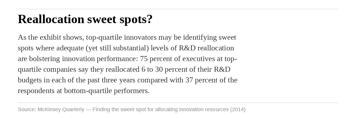
The difference isn’t that top performers are smarter. It’s that they have visibility to act.
When you can see that a project is stalled, you can reallocate its resources. When you can’t see it, you can’t act.
A structured platform with data-driven scoring and transparent decision-making creates exactly this visibility.
Organizations using this approach report measurable reductions in resource waste through more disciplined allocation and faster reallocation cycles.
AI’s Role in Moving From Visibility to Decision
AI has become a fixture in innovation management conversations. In dashboards specifically, it serves one role well: signal amplification.
Three things AI does reliably in this context:
- Pattern recognition: flagging duplicate ideas across departments before they consume separate resources
- Scoring support: identifying ideas that fit evaluation criteria and surfacing them for review
- Stall detection: flagging projects that have been in evaluation longer than normal
These are signal jobs. They bring important information into focus without replacing the human judgment that follows.
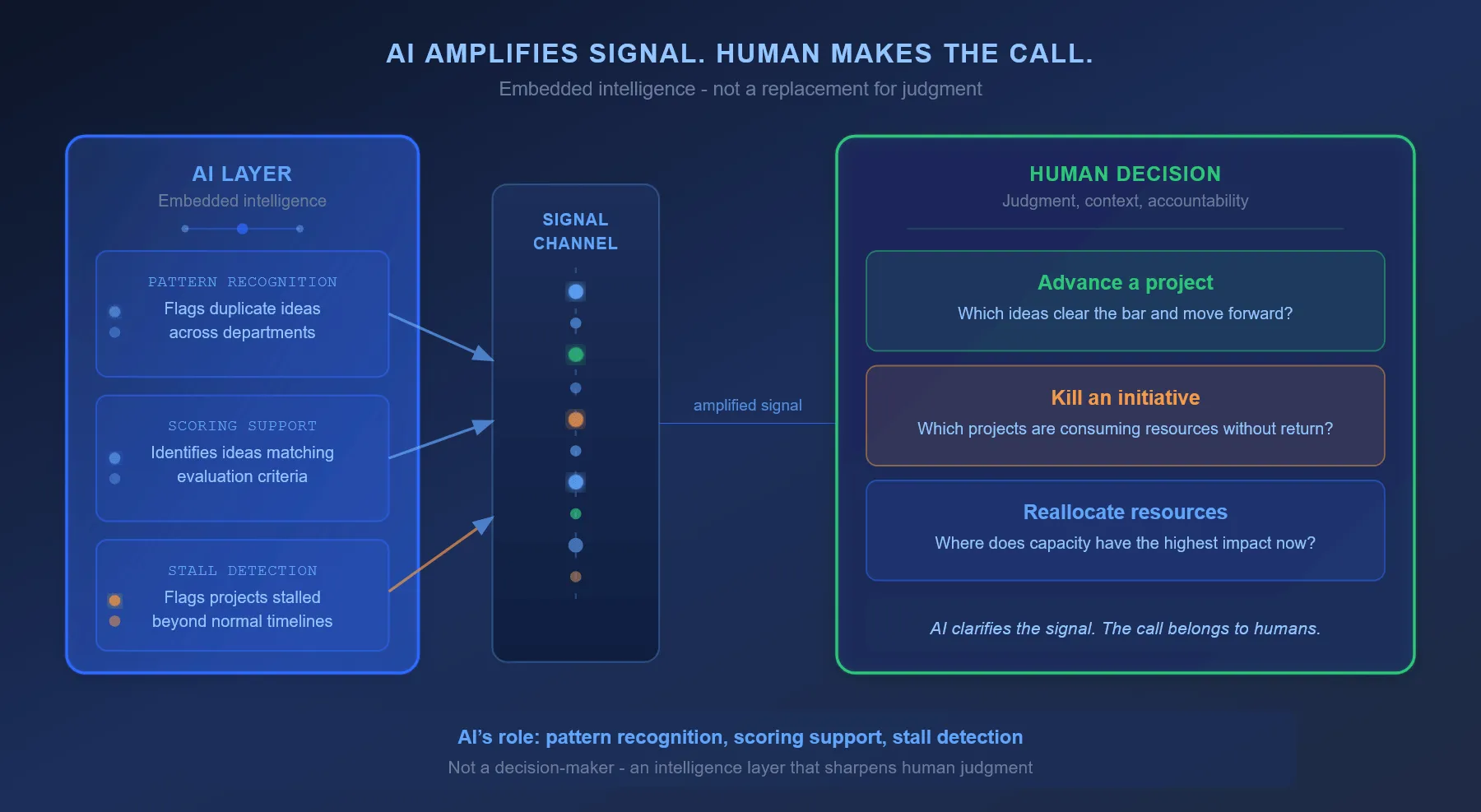
Whether to advance a project, kill an initiative, or reallocate resources: those calls require judgment, context, and accountability.
AI can make the signal clearer. It can’t make the call.
88% of leading innovators report that AI has improved innovation success rates. That’s what the signal-amplification role looks like in practice.
Build the Dashboard That Tells You What to Do Next
The dashboard you need isn’t the most data-rich one. It’s the most decision-ready one.
Most innovation programs have access to the data they need. What they lack is the architecture to turn data into clarity.
The fix requires three practical steps.
- Start with the three questions. What’s ready to advance? Where is waste happening? Where is the bottleneck? Map every metric in your current dashboard against those questions. Which ones provide signal? Which are just noise? Which questions can’t you currently answer?
- Audit your stakeholder roles. Unit-level managers, portfolio leads, executives: each needs a different view. Design separate views for each role, not one view for everyone. The information that matters to a unit manager is not the information that matters to an executive.
- Build the leading-indicator foundation. Evaluation velocity, pipeline balance, scoring progress, gate conversion rates: these are your early warning system. Your dashboard should surface emerging problems before lagging indicators register them.
Lagging indicators matter for reporting. Leading indicators matter for action.
The organizations moving fastest in innovation are the ones that can see clearly where the funnel is flowing and where it’s stuck, and make fast decisions about what to do about it.
That clarity requires design. And it requires a platform with the structure and transparency to support it.
Download our free ebook Project Portfolio: From Opportunities to Value to learn how to establish a single source of truth for your innovation portfolio.
Request a demo to see how Accept Mission gives you real-time visibility, automated reporting, and one unified source across your innovation portfolio.






 English
 Dutch
Dutch Portuguese
 Spanish
 French
 German
 Arabic