
Capacity Heatmaps for Innovation Portfolios: How to Visualize Load, Risk, and WIP10 min read

Most innovation portfolios get approved on potential, not capacity. Leadership signs off on ten new initiatives and wonders two months later why execution has stalled.
The signs show up early, but nobody connects them:
- Key teams are stretched across too many projects at once, with no room to go deeper on any of them
- High-priority initiatives keep missing their timelines for reasons nobody can quite pin down
- New work keeps getting approved while existing work sits stalled upstream
- Status reports stay green even as delivery quietly falls behind
Nearly half of executives say only a quarter or fewer of their innovation projects reach market on time. The execution problem is rarely about effort or intent.
Portfolio decisions often ignore shared team load. A capacity heatmap visualizes load, risk, and Work in Progress before commitments are made.
Why Innovation Portfolios Lose Control of Capacity
Portfolio overload rarely arrives as one bad decision. It accumulates quietly, one approval at a time, while everyone assumes someone else is tracking the cumulative impact.
Three patterns drive that overload, each one invisible in isolation:
- Political accumulation. Stopping projects is culturally stigmatized as failure, so weak initiatives persist alongside strong ones.
- Impact blindness. Each new approval looks affordable in isolation; nobody sees the cumulative load on shared teams.
- Invisible resource-shifting. Rescuing one project quietly degrades several others, but the trade-off never appears in a status report.
HBR calls the second pattern impact blindness: in a five-unit organization where each unit runs three initiatives, frontline managers end up juggling nine, not three.
Senior leaders keep adding projects without accounting for how those projects compound on shared teams. Then the cascade starts.
When a critical project slips, resources get pulled from lower-priority work. The donor project falls behind, people start switching back and forth, and productivity drops as overtime climbs.
When these three patterns overlap, portfolio governance becomes reactive by default. The overload compounds invisibly until the status reports can no longer hide it.
What a Capacity Heatmap Actually Shows
A capacity heatmap is a visual matrix that tracks team load, project risk, and work in flight across the portfolio.
Cells are color-coded by allocation level. The standard thresholds work well as a starting point: under 75% capacity is underallocated, and over 100% is overallocated.
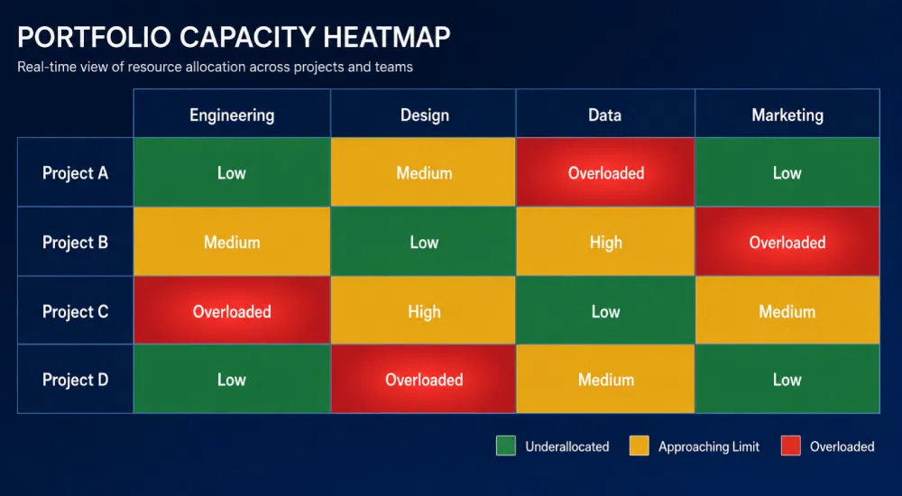
A spreadsheet of utilization percentages tells you nothing at a glance. A heatmap tells you exactly where to look.
The three dimensions each answer a different governance question:
| Dimension | What It Reveals | Decision It Enables |
|---|---|---|
| Load | Which teams, roles, or individuals are overbooked versus underutilized across the portfolio | Where to rebalance, who to protect, which functions need hiring or contracting |
| Risk | Projects structurally likely to slip because their contributing teams are stretched thin | Which initiatives need a scope reset, a delay, or a clear stop decision |
| WIP | How many active projects each team is carrying against a sustainable limit | Whether the portfolio can absorb new work, or whether starts need to pause |
That color coding is the point.
Heatmaps also drill down. A Software Engineering department might appear overallocated January through May at the org level.
Drill in and you find Architecture and Client sub-teams are the actual bottlenecks, while Server is evenly allocated. Same data, three different conversations.
That layering is what gives the heatmap its analytical power. It works at the level the decision needs to be made.
How to Build a Capacity Heatmap for Your Portfolio
Start with the simplest possible matrix: projects on one axis, contributing teams or functions on the other, each cell colored by the load that project places on that team.
| Project | Engineering | Design | Data | Marketing |
|---|---|---|---|---|
| Project A | High | Medium | Low | Low |
| Project B | Overloaded | High | Medium | Low |
| Project C | Medium | Overloaded | Low | Medium |
| Project D | Low | Low | High | Medium |
Even this minimal version surfaces a lot. Any column with multiple “High” or “Overloaded” cells is a team approaching breaking point.
Any row with red cells is a project whose timeline is structurally at risk.
From there, add two more layers:
- Risk layer. Flag any project where contributing teams sit at High or Overloaded. Those flags become the candidate list for your next portfolio review.
- WIP count. Total the active projects each team is carrying and compare against a manageable WIP limit.
This is where Little’s Law becomes useful: cycle time equals WIP divided by throughput.
Reducing active portfolio WIP from 10 epics to 6 at the same throughput cuts cycle time from 5 months to 3, a 40% improvement with no added resources.
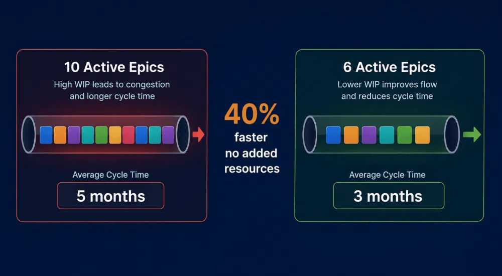
WIP limits don’t have a universal formula. The practical guidance is to start with limits that feel slightly uncomfortable, then treat them as hypotheses, not policies.
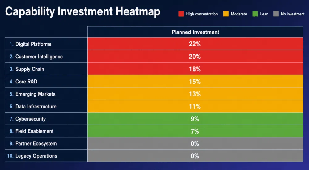
Too high and the limit never triggers; too low and you create artificial bottlenecks. For a more strategic variant, some organizations build a capability investment heatmap instead.
Planned spend is aggregated by strategic capability, with red marking the top third of investment, yellow the middle, green the bottom, and gray for capabilities receiving no planned investment at all.
It’s the same logic applied to money rather than people, and the two views together give a portfolio committee both an execution lens and a strategic alignment lens.
The point of any of these formats is the same. Build the picture before you build the plan.
Reading the Heatmap: What the Zones Are Telling You
Once the heatmap is populated, the zones tell a clear story.
| Zone | What It Signals | What to Do |
|---|---|---|
| Green | Balanced load, manageable WIP, low slip risk | Use these teams for firm delivery commitments |
| Yellow | Load creeping up, WIP approaching the limit | Act now; leverage to fix this cheaply disappears fast |
| Red | Teams overcommitted, WIP limits breached, delivery already at risk | Stop approving new work; something needs to pause or close |
Here’s the hard part:
Organizations that normalize red zones have effectively abandoned portfolio governance, even when their dashboards and steering committees look healthy on paper.
Permanent red is the same as no signal at all.
A red zone emergency usually shows up as a combination of signals:
- Two or more teams sitting at Overloaded across multiple projects in the same time window
- WIP counts well above the agreed limit, with no scheduled completions to bring them back down
- Several high-priority projects sharing the same overloaded team
- Recent resource-shifting that has now created a second project at risk
- Zombie epics still occupying active WIP slots that nobody has formally closed
Zombie epics make red zones worse. These are projects that are functionally dead but not officially closed, and they keep occupying WIP slots that productive work could use.
The sunk cost fallacy makes closing them difficult, but the cost of not closing them is real capacity.
The heatmap doesn’t fix any of these on its own. But it makes them impossible to politely ignore, which is most of what governance actually requires.
Using the Heatmap in Portfolio Reviews
Reporting artifacts get reviewed and filed. A heatmap changes what happens next.
Three behaviors define how effective teams use it in portfolio reviews:
- Open with the heatmap first. Before any new project gets approved, the picture goes up.
- Treat red zones as stop signals. Something needs to pause or re-scope before new work moves in.
- Resist the urge to keep approving. New work added to a stalled system slows the whole portfolio down.
This is the operating principle behind Lean Portfolio Management: stop starting, start finishing. It also changes the questions leaders ask.
In one Cutter Consortium case study, a capability investment heatmap “illuminated new insights for the portfolio leadership committee” and reshaped the organization’s portfolio management process.
The shift was qualitative: the first question in every portfolio review became can we execute this? Periodic portfolio teardowns extend the same logic.
A structured review of whether spending aligns with strategy, whether the portfolio can meet growth expectations, and where allocation gaps exist resets the capacity baseline.
McKinsey reports similar results across portfolio teardowns:
- Consumer electronics: 20% of innovation budget freed
- CPG company: 20% of R&D budget freed
- Chemical company: 12% freed
In each case, available budget was already there. Concentration was the problem, and the teardown made it visible.
Continuous visibility is what turns this from an annual event into a governance habit. Real-time portfolio views, structured scoring, and group decision-making keep the heatmap honest between reviews.
AI-assisted scoring surfaces inconsistencies and supports evaluation quality without replacing the judgment of the people running the portfolio.
The Limit of Heatmaps (and What to Do About It)
A heatmap makes overcommitment visible. It doesn’t remove the organizational incentives that created the overcommitment in the first place.
Three things a heatmap can’t do:
- Cancel a politically protected project
- Create capacity that doesn’t exist
- Replace leadership accountability for trade-offs
Three things it does exceptionally well:
- Surface load imbalances that are invisible at the individual project level
- Make WIP limits concrete and reviewable, not abstract
- Give portfolio reviews a single decision anchor everyone is looking at
HBR makes this concrete: managers in overloaded organizations often see the problem clearly and still can’t fix it, because the roots are political, not analytical.
Overload persists through political logrolling, and organizations that learn to cut wisely accomplish more in the areas that matter.
The tool works when it’s paired with leaders willing to use what it shows. That pairing is the discipline, and the heatmap makes it easier to hold.
Make Capacity Visible Before You Make Commitments
A capacity heatmap isn’t a one-time diagnostic exercise. It’s a governance habit, refreshed every cycle and used at the front of every portfolio decision.
Three disciplines make the difference between having a heatmap and actually using it:
- Open every portfolio review with the heatmap before a single new project gets approved
- Treat every red zone as a stop signal: something needs to pause, re-scope, or close before new work moves in
- Set WIP limits that feel slightly uncomfortable, then hold them between reviews
The organizations that get the most from it treat the picture as the starting point of the conversation, not the wrap-up.
Once load, risk, and WIP are visible, the harder decisions about what to stop and what to protect get easier to make and easier to defend.
Governance still comes down to people willing to act on what they see. The heatmap makes that easier to do, and harder to ignore.
Download our free ebook Project Portfolio: From Opportunities to Value to learn how to establish a single source of truth for your innovation portfolio decisions.
Request a demo to see how Accept Mission gives you real-time visibility, automated reporting, and one unified view across your entire innovation portfolio today.








 English
 Dutch
Dutch Portuguese
 Spanish
 French
 German
 Arabic