
The 1-Page Innovation Report Executives Actually Read11 min read

Every quarter, the same scene plays out in boardrooms. The innovation team presents, and within ninety seconds, half the room has mentally checked out.
Executive reporting on innovation fails in predictable ways:
- A data dump nobody can act on
- A vague “things are progressing” update nobody believes
- Metrics that track activity instead of progress toward a goal
The format compounds it. With no standard structure, teams rebuild slides from scratch every quarter, and the story shifts each time.
One page, every quarter, same format. That’s how you build a report executives actually read.
Why Most Innovation Reports Fail Before They’re Read
There’s a strange gap between how much leaders care about innovation and how little they measure it.
Consider the numbers:
- Most business leaders call innovation a top priority, yet few have formal metrics in place to track it.
- Only 35% of organizations track early-stage pipeline metrics; 60% focus solely on final outcomes.
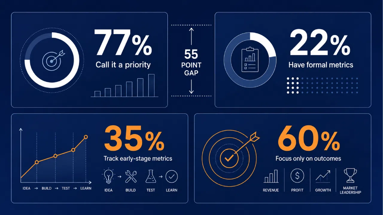
So most teams report only on what already happened, leaving what’s forming invisible. That blinds leadership to the signals that actually predict future returns.
The format problem compounds it.
With no standard structure for innovation reporting, teams rebuild slides from scratch every quarter, and the story shifts each time.
Then there’s the vanity metric trap. Counting ideas submitted feels productive, but it tells leadership nothing about whether those ideas are advancing.
Stage conversion rate tells the real story. The table below shows the gap between what teams usually report and what executives actually need.
| What Teams Typically Report | What Executives Actually Need |
|---|---|
| Number of ideas submitted | Stage-gate conversion rate |
| Count of active projects | Active vs. stalled project ratio |
| Hours logged in workshops | Estimated pipeline value |
| “Engagement is high” | Revenue from implemented innovations |
| Total budget spent | Return relative to spend by horizon |
Every row follows the same logic: the easy metric measures activity; the useful metric measures progress toward a goal.
The Two-Part Structure That Actually Works
A report needs two things working together, or it fails. Each element does something the other can’t.
Numbers without context invite misreading. A drop in active projects could mean a healthy cleanup of zombie work, or a quietly drying pipeline.
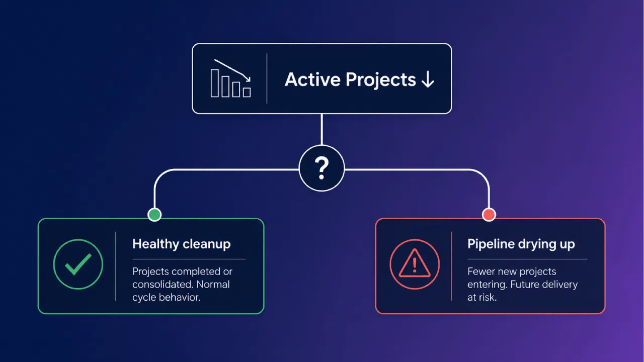
The narrative explains which one you face. The KPIs keep that narrative honest, since a story without data is just spin in a nicer font.
So the one-page report has two parts that work in tandem:
- The narrative. Capped at three bullets, written in plain language.
- The KPI block. Five to seven metrics across three categories, with at least one leading indicator.
That leading indicator matters more than it sounds, given that most organizations track only final outcomes.
The single-page limit is the engine here. You can’t pile on both narrative and metrics, so the format forces you to choose what genuinely matters.
In practice, that constraint does more for decision quality than any amount of extra detail.
The Template: Section by Section
Here is the template, built to fit on one page. Five sections, each with a strict job.
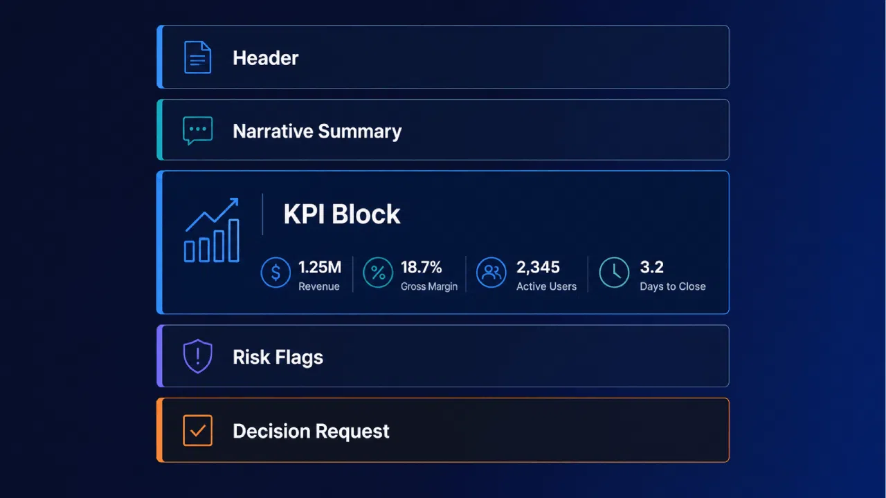
The Header
The header sets context in three lines.
It names the reporting period, the report owner, and one sentence linking this report to the organization’s stated innovation goal.
That last line does heavy lifting. Deloitte argues that measurement must begin with strategy, not metrics.
If you can’t write that sentence, you’ve found where the program actually breaks.
The Narrative Summary
Three bullets, each answering one of these questions:
- What progressed since the last report?
- What’s blocked or at risk?
- What decision does leadership need to make?
Always save this section for last. It’s best to analyze your data first, as a narrative drafted before reviewing the numbers often feels more like a forecast than a grounded insight.
In short, the narrative explains what the data means. A good one tells leadership what to do with it.
The KPI Block
This is the heart of the page. Five to seven KPIs across three categories, each tagged as leading or lagging.
| KPI | Category | Type | What It Shows |
|---|---|---|---|
| Ideas per stage | Pipeline health | Leading | Where volume sits across the funnel |
| Stage-gate conversion rate | Pipeline health | Leading | Whether ideas are advancing or stalling |
| Funnel velocity | Pipeline health | Leading | How fast concepts move between stages |
| H1/H2/H3 horizon balance | Portfolio health | Leading | Mixed near-term and long-term bets |
| Active vs. stalled projects | Portfolio health | Lagging | Whether resources sit in zombie projects |
| Estimated pipeline value | Value indicators | Leading | Projected worth of what’s in flight |
| Revenue from implemented innovations | Value indicators | Lagging | Realized return on past investment |
Leading metrics forecast your portfolio’s future, while lagging ones confirm past outcomes. Always prioritize metrics that align directly with your strategy for effectiveness.
The categories matter more than the exact rows: pipeline tells you about flow, portfolio about balance, and value about impact.
Risk Flags
List one to three risks. Each one needs an owner, a proposed next action, and a clear timeline.
Why the cap at three? Because a report listing nine risks has become a complaint, and stopped being useful to anyone in the room.
Forcing yourself to name the top three is itself a prioritization exercise. It separates what leadership must act on from what the team can handle alone.
The Decision Request
Every report should end with an ask. List zero to two decisions, framed as specific, actionable requests with enough context for leadership to decide.
Vague asks get vague answers. Compare “we need more support on Project X” with a real request:
Approve continuation of Project X. Current spend €200K, projected return €1.2M, decision needed by end of quarter.
The second version gives leadership something to actually decide. This structured ask turns a simple status update into an essential governance tool.
Who Should Own the Report
Ownership of the report should live with one person, by name:
- The natural owner is the innovation lead.
- The PMO supplies the data discipline.
- The exec sponsor signs off before it goes up the chain.
When ownership is fuzzy, the report drifts. It gets skipped in a busy week, or turns into a committee document where four people add a paragraph and nobody cuts.
Pick one accountable owner. That person drafts it, defends the numbers, and decides what stays off the page.
How to Adapt the Template by Maturity Stage
The structure holds across stages. What changes is the emphasis.
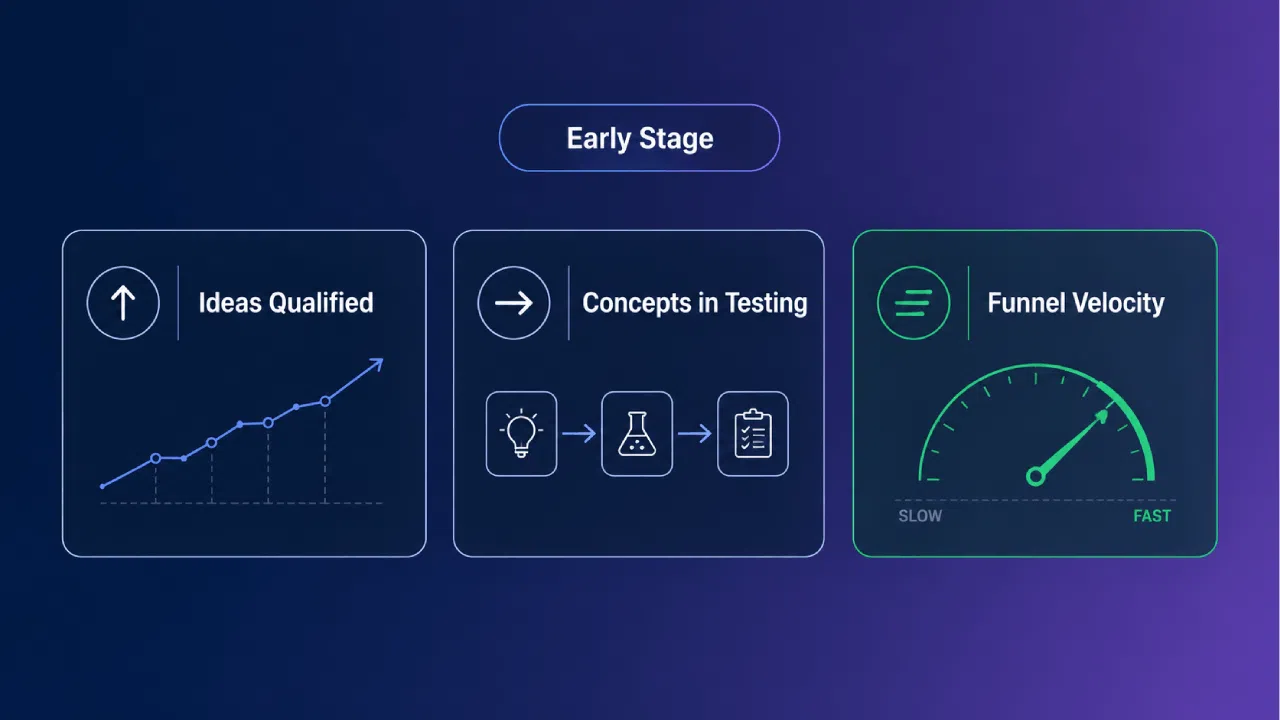
Early-stage programs are still proving the model, so the narrative carries the weight and the KPIs are leading indicators:
- Ideas submitted and qualified
- Concepts moved into testing
- Funnel velocity, not financial return
Scaling programs flip this.
Executives expect outcomes now, so the KPI block leans on revenue influenced, cost saved, and projects shipped, while the narrative shifts toward portfolio health and resourcing.
The report stays one page either way. You’re just changing which numbers earn the space.
How to Fill It Without Spending Hours on Slides
The data is the hard part: scattered across spreadsheets, decks, and half a dozen tools, and rarely in one place. That fragmentation is a documented problem.
An IDC survey found data fragmentation is the top challenge for data leaders, with 37% spending most of their time wrestling with data complexity instead of using the numbers.
So the practical sequence goes like this:
- Pull the KPI numbers from your source of record first.
- Review what the data shows before writing a single word.
- Write the three-bullet narrative last, as an interpretation of the numbers.
Cadence matters too. Quarterly is the minimum that sustains momentum, and active programs benefit from a monthly pulse.
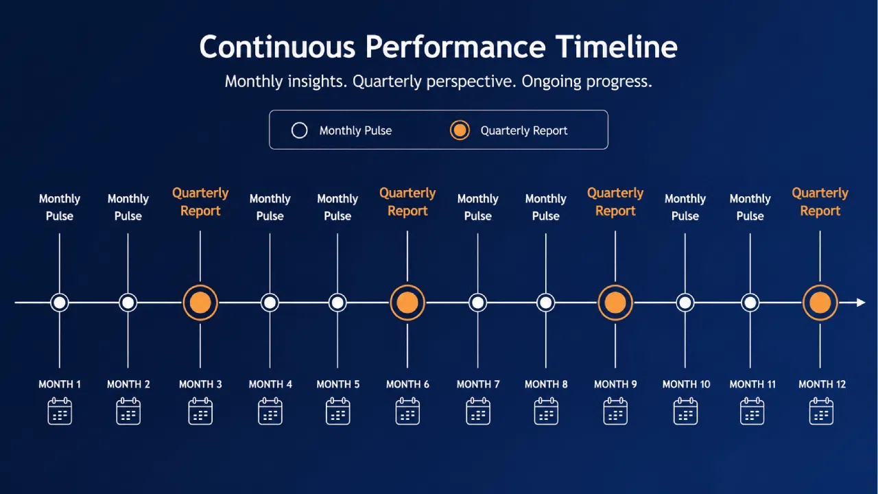
This is where a central system changes the math. When portfolio data lives in one place, the KPIs populate on their own.
A centralized system cuts the time teams spend on data consolidation, shifting the work from gathering to interpreting.
AI-assisted scoring and data aggregation cut the remaining manual consolidation work, so the team shifts from hunting for data to interpreting what it means.
How to Present It, Not Just Send It
Sending the report is half the job. The other half is the five minutes you spend walking an executive through it.
A good walkthrough moves top to bottom: one line on the headline, the two or three KPIs that moved, the flag that matters, then the decision you need.
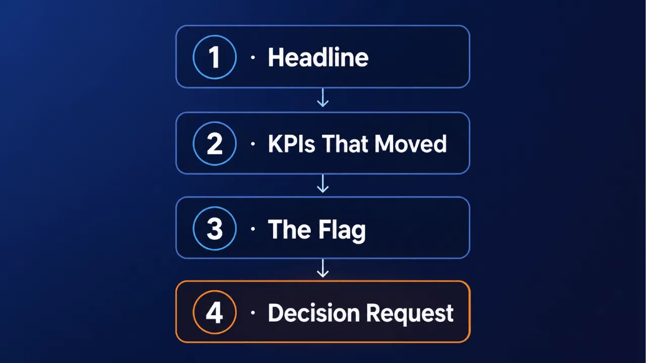
Say what changed and why. Don’t narrate every number on the page. Stop talking once you reach the decision request. Let the silence sit there and do the work.
Common Mistakes That Kill the Format
The format fails in predictable ways, usually from small concessions that compound.
- Adding a sixth section “just this once,” which becomes the new baseline
- Rotating KPIs every quarter, so no trend line ever survives long enough to mean anything
- Treating it as a slide deck with extra steps, complete with builds and transitions
- Padding the narrative until the decision request gets buried
Each of these feels reasonable at the moment. Hold the line on five sections and a stable KPI set, and the report keeps doing its job.
The discipline is the value.
Red Flags in Your Current Report
Most failing reports look fine until you read them with fresh eyes. Run yours against this quick check.
- It runs longer than one page
- Nobody can name the single decision it asks for
- The KPIs changed since last quarter, so trends are invisible
- It gets forwarded but never discussed in a meeting
- The risk section is either empty or hedged into meaninglessness
Two or more of these, and the format has quietly stopped working. The fix is rarely more content, it’s usually cutting back to the discipline you started with.
Connecting the Report to Budget Decisions
The KPI block is what turns this from a status update into a governance tool. Each metric should map to a resource question an executive can actually act on.
When funnel velocity slows, that’s a staffing conversation. When a concept clears its validation gate, that’s a case for further funding.
Tie every KPI to a lever someone controls. That is what gets the report invited into the budget meeting instead of the inbox archive.
Build the Discipline, Not Just the Document
Most teams can write the template in an afternoon. The harder part is committing to it, quarter after quarter, without drift.
The discipline holds on three things:
- Same format, every quarter, so executives always know where to look
- Same KPI set, so trends become visible across time
- A stable cadence, so the report becomes part of the rhythm, not a disruption
A single page forces one question every quarter: what matters enough to report? Answering it well is harder than building any dashboard.
Anchor every metric to a strategic goal. If a number doesn’t trace back to that goal, it doesn’t belong on the page.
When leadership can actually trust the numbers on the page, the conversation changes. A consistent reporting rhythm gives innovation teams the cover to take real bets.
Download our free ebook Project Portfolio: From Opportunities to Value to learn how to build a clear, consistent reporting structure your leadership will trust.
Request a demo to see how Accept Mission gives you real-time portfolio data, automated reporting, and a single consistent view of your innovation program.

![[Discussion] The role of a Chief Innovation Officer (CINO)](https://www.acceptmission.com/wp-content/uploads/2022/02/boss-shaking-hands-with-employee-at-meeting-500x383.jpg)






 English
 Dutch
Dutch Portuguese
 Spanish
 French
 German
 Arabic