
The Innovation Dashboard Glossary: Conversion, WIP, Cycle Time, and the Metrics That Matter10 min read
Open any innovation dashboard and you see terms lifted straight from lean, agile, and project management. The words are familiar, which is the problem.
These terms mean something different inside an innovation funnel:
- WIP is not a task count. In an innovation portfolio, it is a set of bets competing for the same scarce review attention.
- Cycle Time is not a sprint velocity. It is the signal of where ideas are actually getting stuck.
- Conversion Rate is not an e-commerce metric. It is the clearest indicator of gate process health.
Use them without understanding the translation gap, and you will misread your dashboard’s signals. That gap matters more than it used to.
Only 22% of companies have effective innovation metrics, yet 79% of boards now require quarterly KPI reviews. Without shared vocabulary, no dashboard conversation gets far.
This glossary defines 15 terms, organized by metric family, so you can walk into a portfolio review with the language to steer it.
How to Read This Glossary
The terms here are grouped by metric family, not listed alphabetically. That is deliberate, because metrics are most useful when read against their neighbors.
Four families are covered:
- Funnel and Flow: how ideas move through the pipeline
- Portfolio Health: the quality and balance of the portfolio as a whole
- Decision Quality: whether the decisions inside the funnel are any good
- Engagement and Input: the quality and volume of what enters the funnel
Each entry follows the same structure: a definition, why it matters, the healthy signal to look for, and the common pitfall that trips teams up.
Some terms are inverses, like Conversion Rate and Drop-off Rate, or Kill Rate and Yield Rate. Cross-references are noted where this happens.
Funnel and Flow Metrics
These are the core metrics describing how ideas move through the pipeline. They answer one question: is the funnel actually flowing, or is it congested?
Conversion Rate
The percentage of ideas or projects that advance from one stage to the next. On most innovation dashboards, this is the single most-watched number.
Healthy ranges shift as ideas mature: 30–50% at intake, 50–70% at concept, and 60–80% at business case. The pattern matters more than any one figure.
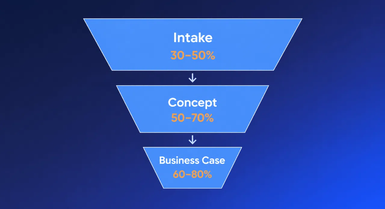
Here is the catch. A very high conversion rate at early stages usually signals a tunnel problem: ideas are passing through without being challenged.
Always read Conversion Rate alongside kill rate and a quality measure.
Drop-off Rate
The inverse of Conversion Rate. If 60% of ideas convert at a stage, 40% drop off.
On its own, the headline number tells you little. Stage-level drop-off is the real diagnostic.
High drop-off at late stages is the expensive kind: resources were poured into ideas that should have been stopped earlier.
Throughput
The number of ideas or projects completing a stage in a given period: your funnel’s output rate.
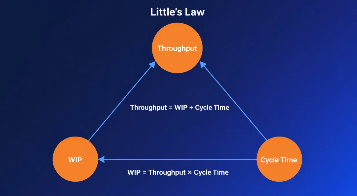
Throughput connects to flow through Little’s Law: Throughput = WIP / Cycle Time.
The pitfall is treating speed as success. Fast throughput paired with weak gate criteria simply means bad ideas reach development faster.
Cycle Time
The time an idea takes to move through a stage, or the full funnel. For early-stage gates, 2–4 weeks is healthy.
Little’s Law applies here: Cycle Time = WIP / Throughput.
The common mistake is averaging Cycle Time across all stages. A blended average hides the one bottleneck stage where everything is actually stuck.
WIP (Work In Progress)
The count of active ideas or projects in-flight at any stage.
In an innovation portfolio, WIP is not a measure of momentum. It is a measure of load.
WIP completes the Little’s Law triangle: WIP = Throughput × Cycle Time. When WIP is uncapped, Cycle Time inflates mechanically, because every extra item adds queuing delay.
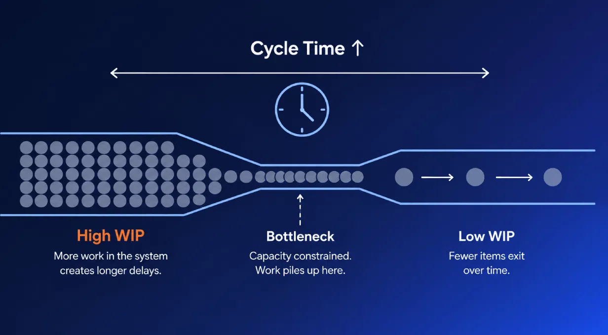
A bulging pipeline often gets read as health when it is really overload.
Funnel Velocity
A composite measure of how efficiently the funnel produces decisions.
Where Throughput counts items, Velocity captures the consistency and speed of decision output.
Watch the relationship between velocity and submission volume. If velocity stays flat while submissions climb, the funnel is filling faster than it can process.
That is a backlog forming in slow motion.
Portfolio Health Metrics
These metrics step back from individual flow and describe the quality and balance of the portfolio as a whole.
Kill Rate / Attrition Rate
The percentage of ideas terminated at each gate.
A healthy Kill Rate is high early and low late. This is the opposite of how many teams instinctively run their funnels.
| Stage | Healthy Kill Rate |
|---|---|
| Gate 1 / Gate 2 (Screening) | 60–70% |
| Concept → Development | 40–50% |
| Development → Pilot | 20–30% |
| Pilot → Launch | 10–20% |
A low kill rate at early gates points to a tunnel problem: ideas are not being filtered.
High kill rate at late stages is the expensive failure, where significant resources are written off. Read Kill Rate as the natural counterpart to Conversion Rate.
Yield Rate
The percentage of submitted ideas that reach a defined milestone, such as launch. For high-ambition portfolios, 3–5% is typical.
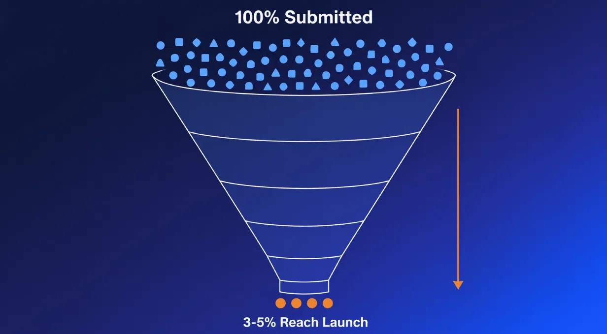
A high Yield Rate sounds like good news, but it can signal a portfolio playing it safe. When only incremental ideas are advancing, yield rises while ambition quietly falls.
Always read it against portfolio distribution.
Portfolio Distribution
The mix of work across innovation horizons. The widely cited 70-20-10 model gives a useful starting balance, and companies following it tend to outperform peers.
| Horizon | What It Is | Resource Target |
|---|---|---|
| Core | Incremental improvements to existing products and markets | 70% |
| Adjacent | Expansion into related products, markets, or capabilities | 20% |
| Transformational | New-to-the-world bets, high risk, high potential | 10% |
The pitfall here is subtle. Applying Core-style KPIs to Transformational bets systematically kills them, because big bets cannot show fast conversion or near-term revenue.
Different horizons need different yardsticks.
Idea Age / Staleness
The time since an idea last moved forward. It is the cleanest measure of a stalling funnel.
A common zombie threshold is 60–90 days without a decision. Past that point, an idea is consuming attention without producing anything.
Projects carrying two or more blockers are 3.5x more likely to stall. Quarterly cleanup sessions triage stale ideas and keep the number honest.
Decision Quality Metrics
Flow and balance tell you how the funnel moves. These metrics tell you whether the decisions inside it are any good.
Time-to-Decision
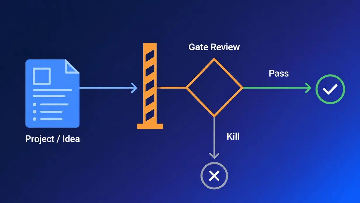
The elapsed time from a gate submission to an actual decision. A healthy SLA is 2–4 weeks for early stages and 4–8 weeks for later ones.
Two failure modes exist, not one. Slow decisions stall the funnel, which is obvious.
Less obvious is the rubber-stamp: a fast decision with no real scrutiny behind it. Speed without rigor is not a win.
Gate Hit Rate / Gate Pass Rate
The percentage of projects reviewed at a gate that pass it.
The benchmarks are fairly settled: 70–90% is strong, 50–69% is moderate concern, and below 50% calls for root-cause analysis.
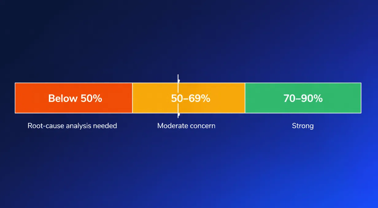
Watch the top of that range too. A Gate Hit Rate above 90% often means the gate criteria are not being applied with any real bite.
Scoring Calibration / Inter-Rater Reliability
The consistency among evaluators scoring the same idea. When variance between reviewers is high, outcomes are driven by who reviews an idea rather than what was submitted.
Prestige bias is the usual culprit. In uncalibrated systems, ideas from senior or well-known submitters reliably score higher, regardless of merit.
A few practices keep scoring honest:
- Run quarterly calibration sessions using a fixed reference set of ideas
- Use blind review so submitter identity does not influence scores
- Document scoring criteria and track when they drift over time
- Bring in AI-assisted scoring to flag outlier evaluations and surface where two reviewers disagree sharply
That last point is worth a note. AI here is not making the call; it is widening the team’s view of where its own judgments are inconsistent.
Engagement and Input Metrics
Everything above depends on what enters the funnel. These two metrics describe the quality and volume of the input itself.
Submission Volume
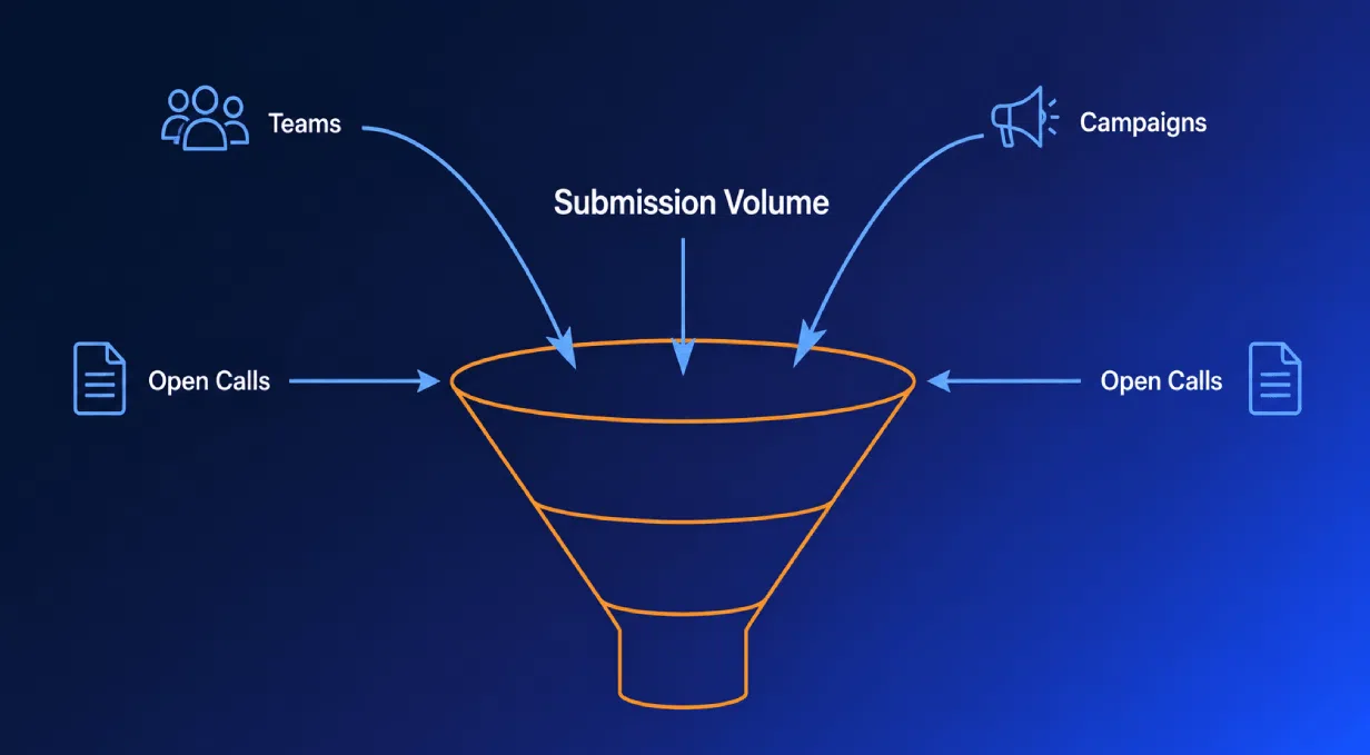
The total number of ideas submitted in a period.
It is the most common metric on innovation dashboards, and the easiest to misuse. Tracked alone, Submission Volume is a vanity metric.
High volume can mean healthy engagement, or it can mean noise. Only the downstream quality metrics tell you which.
Campaign Response Rate
The percentage of invited participants who actually submit. In enterprise employee programs, 10–30% is a healthy range.
The trend matters more than the snapshot. A declining response rate signals a broken feedback loop: people submitted before, saw nothing happen, and stopped bothering.
Engagement is a reflection of whether past ideas were ever treated seriously.
Vanity Metrics vs. Signal Metrics
Some numbers look like progress without informing a single decision.
A simple test separates them: can you make a business decision with this metric, can you intentionally reproduce the result, and does it honestly reflect what is happening?
| Vanity Metric | Why It Misleads | Better Alternative |
|---|---|---|
| Raw idea count | Counts input, says nothing about quality or outcomes | Stage conversion rate |
| Total experiments run | Activity volume, not learning or progress | Funnel velocity |
| Participation rate | High participation can still produce low-value ideas | Campaign response rate trend |
| Patents filed | A lagging legal output, disconnected from market value | Yield rate to launch |
There is a second axis worth holding onto. Leading indicators (stage conversion, WIP, cycle time, funnel velocity) describe process and output, and you can act on them now.
Lagging indicators (revenue from new products, ROIC, market share) confirm outcomes after the fact. A good dashboard carries both.
Putting the Glossary to Work
No single metric tells the full story. A dashboard is a system of signals, read in combination rather than chased one at a time.
A few combinations do most of the work:
- WIP + Cycle Time tells you whether the funnel is overloaded or genuinely flowing
- Kill Rate + Yield Rate + Portfolio Distribution tells you whether the portfolio is balanced or quietly drifting toward safe bets
- Gate Hit Rate + Time-to-Decision + Scoring Calibration tells you whether your decisions are rigorous or just fast
This is where structure and transparency stop being abstractions. When every metric is defined the same way and visible in one place, reviews become evidence-based.
Teams using centralized overviews report up to 30% faster decision-making and higher implementation rates. Shared vocabulary turns your dashboard into a steering instrument.
That is the difference between watching innovation happen and managing it toward measurable business impact. The right vocabulary makes that shift possible.
Download our free ebook Project Portfolio: From Opportunities to Value to learn how to turn these dashboard metrics into more confident, evidence-based portfolio decisions.
Request a demo to see how Accept Mission gives you a structured innovation dashboard with the metrics, funnel views, and reporting your reviews need.






 English
 Dutch
Dutch Portuguese
 Spanish
 French
 German
 Arabic