
Why Nobody Opens Your Portfolio Dashboard: 3 Audiences Need 3 Views (Not 3 Filters)15 min read

The dashboard went live in March. By June, the executive sponsor had stopped opening it, and the delivery leads had quietly rebuilt their own tracker in a spreadsheet.
The build had assumed 4 things:
- That the same rows matter to everybody, just at different levels of detail.
- That one refresh rhythm can serve a quarterly funding call and a daily standup.
- That permissions are a segmentation strategy.
- That a leader who stops opening it needs a nudge.
None of that holds. Your 3 audiences each want a different set of rows, because each one owns a different decision.
For an executive, a row is a bet – for a portfolio manager, it’s a queue – and for a team, it’s a task.
No filter turns one of those into another. That’s why people stop opening the shared dashboard and go build the view they actually need.
Why “Add a Filter” Isn’t Segmentation
The filter model is seductive because it’s cheap. You build 1 dashboard, add a role toggle, hide a few columns, and call it 3 views.
But a filter narrows a set of rows without changing what a row is.
| Audience | What sits on a row | The decision it feeds | How often the decision reopens |
|---|---|---|---|
| Executive | A bet (a domain or portfolio slice) | Where money and mandate go next | Quarterly, at funding points |
| Portfolio manager | A stage, and its queue | What to unblock, rebalance, or flag for a kill decision | Weekly |
| Team | A task | What to do next, and what’s blocking it | Daily |
Read the 3rd column down. Those 3 decisions don’t nest inside each other.
No amount of zooming turns one into another. Filtering a task list to one strategic domain gives an executive a shorter task list, not a portfolio of bets.
The tell is easy to check. Open the role toggle and see whether the row headings change, or only the row count.
What a Single Dashboard Has to Assume
Stephen Few’s 2006 paper separates monitoring from analysis, a line portfolio tooling tends to blur. Storytelling, informing, teaching and analysis each need a different design.
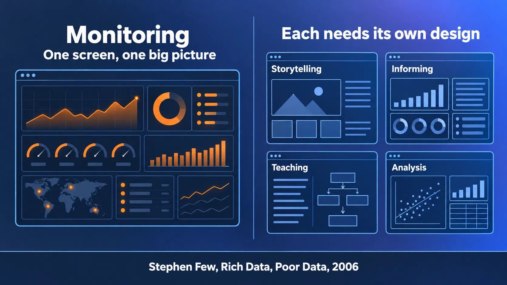
He also set a hard constraint on monitoring. The big picture “will never be seen if the information is spread across multiple screens.”
So a single screen has to hold one audience’s big picture. Serve 3 and you either scroll, or you lose the picture you came for.
Permissions don’t rescue this. They control who sees a row, never what the row means.
Why Drilling Down Doesn’t Dissolve It
Shneiderman’s 1996 taxonomy gave the field its reflex: “Overview first, zoom and filter, then details-on-demand.”
It works within an axis, though. The exec view isn’t above the queue view on that ladder, it’s a different ladder built from the same records:
- Drilling from a portfolio total into its projects keeps the project as the unit of analysis.
- Grouping those records by domain instead turns the unit into a bet.
- The totals should reconcile, because it’s one pile, but the rows won’t line up, because the grouping differs.
A role toggle stays on the 1st ladder. It hides rows along the axis you already chose. Which is why “add a filter” keeps producing dashboards nobody disputes and nobody opens.
The numbers all add up. They just don’t answer the question the person opening it came with.
The Executive View: The Row Is a Bet
More project information won’t help an executive here. What’s missing is a defensible answer to one question: what do we stop funding in order to fund something else?
That question is the entire job of the executive view. McKinsey’s 2024 piece on capital allocation brings together 2 findings worth sitting with:
- In a McKinsey survey of over 1,200 executives, less than one-third said their budgets were similar or very similar to their most recent strategic plan.
- A separate study it cites found a striking 90 percent correlation in investment spending from year to year.
Money keeps moving along last year’s lines, and nothing on the screen presents last year’s lines as a choice.
A 2016 McKinsey analysis found a third of companies reallocate about 1% of capital year to year, against an average of 8%.
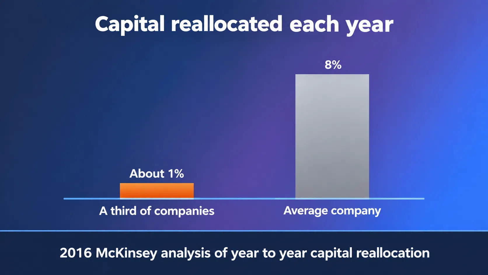
The same analysis puts active reallocators at a 10% shareholder return against 6% for sluggish ones. That’s a correlation across firms, not evidence that moving money causes returns.
The Decision Here Is Reallocation
Every row on this view should be a slice you could genuinely defund. If a row can’t lose its funding, it’s context, not a bet.
Practically, that means grouping by strategic domain, horizon or market, not by project. Each row then carries 4 things:
- What’s committed so far
- What’s come back
- What the next tranche would buy
- A named sponsor
Everything else is decoration.
PMI’s 2014 research ranks actively engaged executive sponsors as the top driver of project success. Yet fewer than 2/3 of projects and programs have one assigned.
Sponsors in PMI’s full report juggle 3 projects at a time, averaging 13 hours a week on each. Design the row for that budget of attention.
What Gets Cut
Cutting is the hard part, and the tell of a real executive view is what’s missing from it. 4 things go:
- Task status
- Stage counts
- Gate dates
- Owner names below sponsor level
The argument for keeping them is familiar: somebody might ask. Board time has a ceiling, whatever anyone might ask for.
Directors in a 2013 McKinsey global survey said their boards spend 28% of their time on strategy, and just 12% on risk management.
That’s board time, not individual executive time. Still, it’s a fair guide to how much a quarterly view can realistically carry.
The Portfolio Manager View: The Row Is a Queue
The portfolio manager sits where the work actually jams. Their view exists to find the jam and decide what moves.
So the row is a stage, and its queue is the number that matters.
Robert Cooper and Scott Edgett are blunt about new-product portfolios. In their account, most companies have too many projects underway for the resources available, producing pipeline gridlock.
Leading Signals Beat Lagging Ones
Klakegg and colleagues, writing on early warning signs, note that project performance measures are traditionally lagging indicators, consequences of activities and incidents rather than predictors.
| Candidate metric | What it tells you | When it reaches you |
|---|---|---|
| Projects completed this quarter (the counter-example) | The outcome of past choices | After the fact |
| Days in current stage | Where the queue is backing up | While it’s forming |
| Items entering vs. leaving a stage | Whether load is growing | Once a week’s data lands |
| Approvals waiting on a decision maker | Who the bottleneck is | Immediately |
Donald Reinertsen’s principles of flow put the design rule simply: select control variables that predict future system behavior.
He also holds that capacity utilization increases queues exponentially. Push a stage toward full load and its queue grows far faster than the load does.
A stage count on its own won’t show that, because a busy stage and a jammed one can hold the same number of items.
Cooper and Edgett’s own figure, drawn from client work and not a sampled study, is that companies run too many projects by a factor of two or three.
In practice, the queue view is where that shows up first. Items whose age in a stage keeps climbing are the tell you can see without asking anyone.
WIP, Gates, and What the Manager Decides
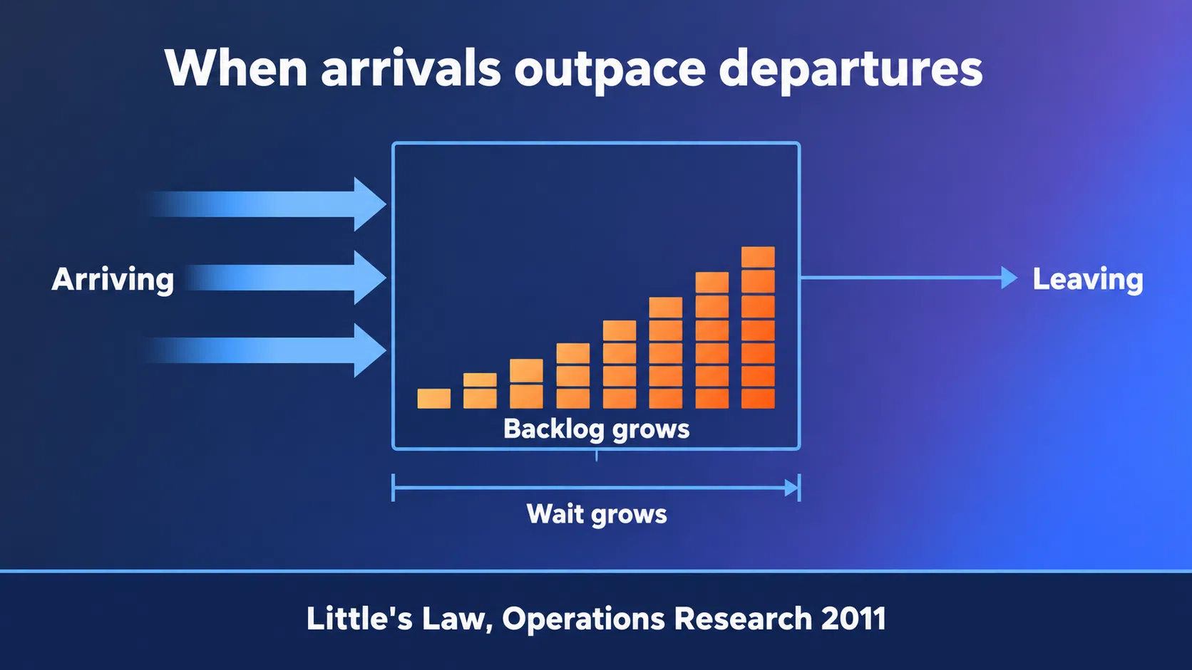
Little’s Law is the identity underneath all of it: average items in the system equal arrival rate x average time in the system.
It doesn’t tell you to cut work in progress. What follows is narrower: if items keep arriving faster than they leave, the backlog and the wait both grow.
On gates, Cooper is emphatic: they’re “‘forward-looking’, where resource commitments are made!” So the manager’s view should show 3 things:
- Which gates are due
- What evidence each one still lacks
- The weakest items in each stage
A gate the manager can’t prepare for is a status meeting with a better name.
The 2nd item is the easiest to leave off. A gate date with no readiness signal says when to worry, and nothing about what to fix.
Kill decisions are the easiest to defer quietly. Without that 3rd item, the queue view isn’t helping anybody rebalance anything.
The Team View: The Row Is a Task
Of the 3 views, the team view is the easiest to build last, or skip. When that happens, teams get a read-only slice of a management view.
The row here is a task, and the decision is what to pick up next. The observational evidence on fragmented work sets the scale:
- 24 information workers, observed across more than 700 hours.
- 57% of their working spheres were interrupted.
- When a sphere was resumed the same day, getting back to it took an average of 25 minutes 26 seconds.
That figure from Mark, González and Harris’s 2005 study is resumption time, not a productivity loss, and the distinction matters.
Participants worked on about 2 other spheres before returning, so it isn’t all reorientation. A view that demands reorientation every time it’s opened still adds to it.
So the team view has 1 job, and it’s a narrow one. Answer what to pick up next, without a detour.
Feedback That Comes From the Work Itself
Hackman and Oldham’s 1976 paper defined 2 job characteristics that matter for a team view:
- Feedback: “direct and clear information about the effectiveness of his or her performance,” obtained from carrying out the work itself.
- Autonomy: “substantial freedom, independence, and discretion” in scheduling work and choosing procedures.
The feedback definition’s final clause is where portfolio dashboards break. A status field updated for a weekly roll-up is feedback from the reporting cycle, not from the work.
Hackman and Oldham wrote general job-design theory, not dashboard research. The principle is still relevant: show the queue, the blockers and the dependencies, then let the team order it.
A view that pre-ranks someone’s day has taken the scheduling back without saying so.
A team view also has to be stable. If the layout shifts every week, each visit starts with a scan instead of an answer. The team view is the one place where a daily rhythm is the right call.
What Breaks When the Views Leak
Leaks don’t need a decision. Somebody forwards a screenshot, a link gets shared, and a view built for one audience lands in front of another.
Each direction has its own failure mode to watch for.
| Leak | How the audience reads it | What degrades | What to watch for later |
|---|---|---|---|
| Team view shown upward | Task status as portfolio health | Reporting turns optimistic | Fewer red flags, raised later |
| Exec view shown downward | The headline metric as the target | Numbers get managed | The metric improves, the bet doesn’t |
| Queue view shown upward | Stage throughput as progress | Throughput substitutes for judgment | Stages empty, mandate unchanged |
The 3rd row is the easy one to miss. Emptying a stage looks like progress even when the portfolio hasn’t moved.
Watch what that does to the queue view once a sponsor starts reading it. The cheap items go first, because they’re what clears.
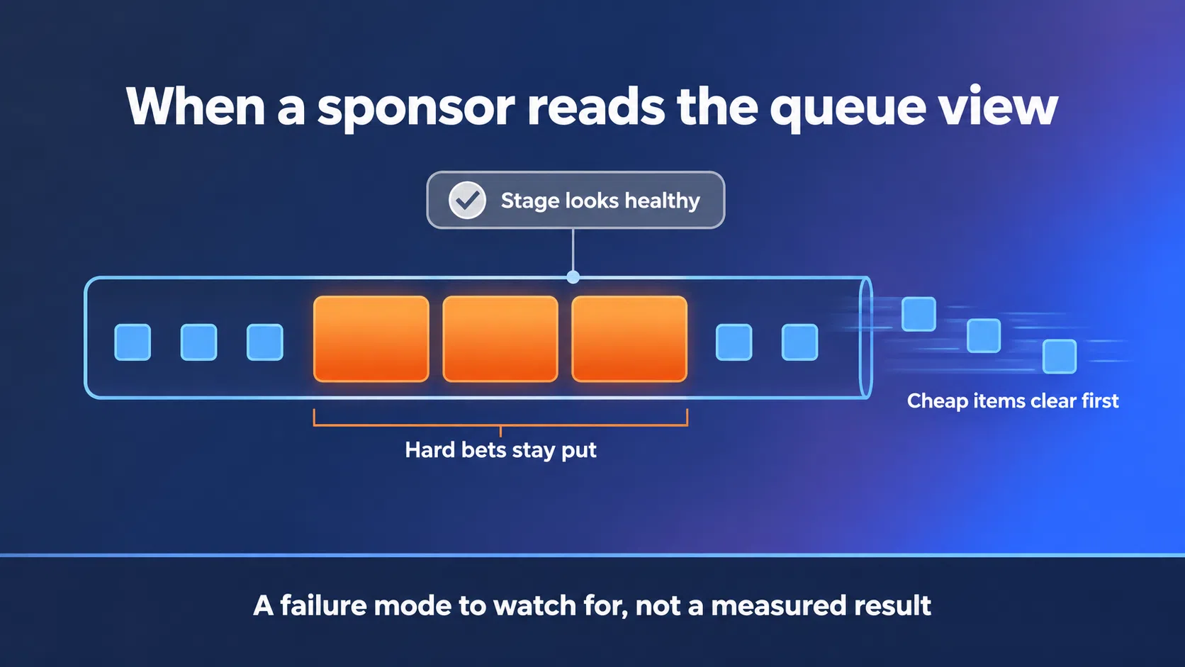
Expect the stage to look healthy and the hard bets to sit where they were.
Both of the first 2 patterns are documented well outside portfolio management. Dashboards just give them a faster channel.
None of this needs bad faith to happen. The view arrives, and the audience reads it the way their job trains them to.
The Team View Shown Upward Gets Optimistic
Upward reporting has been studied from 3 angles:
- Keil and colleagues note that complex IT projects “do not fail overnight; they fail one day at a time.”
- Keil’s 2007 survey of software project managers, with Snow and Wallace, found status reports were biased 60% of the time, twice as likely to be optimistic as pessimistic.
- In a 2003 interview study of 40 employees, 34 said that, at least once, they’d felt unable to raise an important concern with their boss.
The 3rd is a small qualitative study, not a population estimate. The shape it describes will be familiar anyway.
Point the team view upward and you add an audience with budget authority to a feed built for peers. Expect the reds to soften.
The Exec View Shown Downward Gets Gamed
Push an exec view downward and its handful of headline numbers become the scoreboard people are judged against. The warning about that has a long lineage:
- Charles Goodhart’s 1975 work on monetary policy supplied the underlying law.
- Keith Hoskin later gave it the label “Goodhart’s law.”
- Marilyn Strathern wrote the compressed version in 1997: “When a measure becomes a target, it ceases to be a good measure.”
The numbers will move. Whether the underlying bets move with them is a separate question.
Ethan Bernstein’s 2012 field study is the uncomfortable one. At a Chinese factory, curtains hid 2 of 16 production lines from managers’ view.
Defect-free units per hour rose by as much as 10%-15% after the first week, and held across the 5-month study.
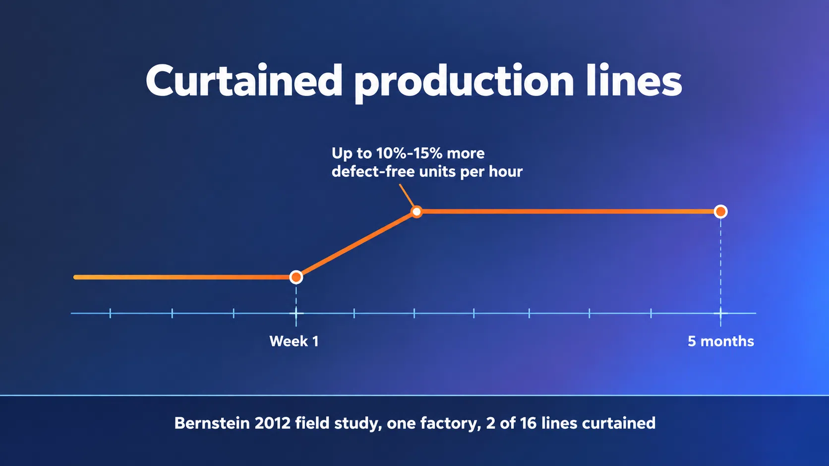
To be fair, that research studied line workers hiding their own process improvements, not dashboards. The mechanism is still here: visibility to managers changes group behavior, sometimes against you.
Neither failure mode announces itself. You find out when a number that looked fine for 3 quarters turns out to have been managed.
Building 3 Views From 1 Source
This doesn’t call for 3 disconnected tools. One dataset can carry 3 read models, each shaped for a single audience.
A read model is a query with a point of view, and the point of view is the decision it serves.
The source stays shared, with projects, tasks, stages, owners, spend and gate evidence living in one place. Each view changes the grain, the measures and the cadence.
One Dataset, 3 Read Models
Each read model needs 3 commitments before anyone opens a design tool:
- A named decision the view exists to support, written as a sentence.
- A named owner who makes that decision and answers for the outcome.
- A cadence set by how fast the decision reopens, not by how fast the data refreshes.
Miss the 2nd and you get a view that nobody owns. Miss the 3rd and you get 1 rhythm serving 3 tempos.
That’s the quiet cost of the single dashboard. It’s stale for one audience and noisy for another, and no refresh setting fixes both.
Daily for tasks, weekly for queues, quarterly for bets anchored to the funding calendar.
Each cadence follows from its decision. Treat those rhythms as a starting point, then adjust to who holds the decision.
Where Tooling Earns Its Place
3 read models mean 3 things to maintain, and maintenance is the cost to budget for first. Software earns its place by taking on 2 jobs:
- Deriving each view from one set of records, so nobody reconciles 3 exports every Monday
- Drafting the note under a queue, or flagging rows that moved
Automated summarization can help with that 2nd job. Keep the judgment with the named owner.
If the exec view was the one requested, expect the first build to over-deliver on it. Budget the review time the other way round.
Governance is the other half of it. Permissions still matter, they just stop pretending to be segmentation.
And the 3 views should reconcile. If a domain looks like it’s gaining ground while the stage its work sits in is jammed, surface the conflict.
Name the Decision Before You Draw the Chart
The dashboard your sponsor stopped opening was missing a decision. No chart fixes that. So start the rebuild with one sentence, before any data model.
Run it in this order:
- Take the view nobody opens and write the decision it was meant to serve.
- Name the person who owns that decision.
- Rebuild the view from that sentence, cutting every column that doesn’t feed it.
- Set its refresh by how often that decision reopens.
If you can’t write the sentence, you’re building a report. Reports are useful, they just shouldn’t carry a dashboard’s expectations.
The test for an existing build is cheap and slightly uncomfortable. Ask each view’s owner what they changed last month because of something they saw.
Give each audience a view built around its own decision, and the reason to open the dashboard comes back.
Download our free ebook Project Portfolio: From Opportunities to Value to see how portfolio structure, progress and health tracking, and visualization fit together in practice.
Or request a demo to see how Accept Mission gives you role-based portfolio views, stage progression and real-time reporting on one shared set of records.







 English
 Dutch
Dutch Portuguese
 Spanish
 French
 German
 Arabic