
 Doc Summary
Why this feature is needed #
Innovation teams need a clear and structured overview of how ideas and projects move through the innovation lifecycle. Without consolidated insights, it becomes difficult to understand pipeline health, strategic alignment, engagement levels, and portfolio performance.
The Innovation Dashboard provides a centralized view of key metrics and structured reports. It allows innovation leads and portfolio owners to monitor performance, identify bottlenecks, compare time periods, and support evidence-based Decision-making.
What this feature is #
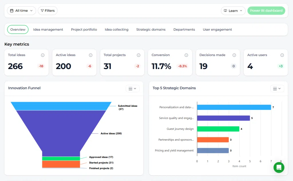
The Innovation Dashboard is the main reporting environment within the Innovation Studio. It consolidates data from idea management, project portfolio management, strategic domains, departments, and user engagement into structured visual reports and KPIs.
It connects the full innovation lifecycle, from idea collection to project execution, and translates activity into measurable performance insights.
Platform Area: Innovation Studio
Access Level: Power User (Innovation Managers, Portfolio Owners, Admins)
Navigation path: Innovation Studio → Dashboard
How to use this feature #
The Innovation Dashboard is organized into tabs. Each tab focuses on a specific reporting domain while maintaining consistent filtering and export logic.
At the top of the dashboard, you define your reporting scope using time filters and advanced filters. All KPIs and visualizations automatically update based on these selections.
Dashboard structure #
- Overview – Full lifecycle summary
- Idea Management – Idea performance and evaluation insights
- Project Portfolio – Project progress and portfolio health
- Idea Collecting – Source and campaign reporting
- Strategic Domains – Alignment across domains and departments
- Departments – Organizational reporting
- User Engagement – Participation and experience metrics
Key metrics section #
At the top of each dashboard tab, key performance indicators (KPIs) are displayed. These typically include:
- Total ideas
- Active ideas
- Total projects
- Conversion rate (idea to project)
- Decisions made
- Active users
When a time filter is applied (for example “Last 30 days”), the system automatically compares results with the previous equivalent period.
Filtering and time range #
The dashboard supports both quick presets and advanced filtering.
Date range #
- All time
- Today
- Yesterday
- Last 3 days
- Last 7 days
- Last 30 days
- Custom date range
Preset ranges apply instantly. Custom date ranges require confirmation.
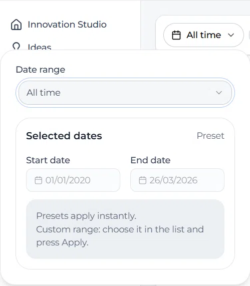
Screenshot: Date range selector
Description: The date range dropdown showing preset options such as All time, Today, Last 7 days, and Last 30 days.
Advanced filters #
You can refine dashboard results using structured filters:
- Department
- Category
- Innovation type
- Organization units
- Strategic domains
- Tags
- Idea funnels
- Project funnels
- Idea status
- Project status
Screenshot: Advanced filters panel
Description: The filters side panel showing selectable filters such as department, category, strategic domains, tags, idea funnels, and project funnels with Apply and Reset buttons.
Report visualizations #
The dashboard includes structured visual reports such as:
- Innovation Funnel – Shows idea progression from submission to finished projects.
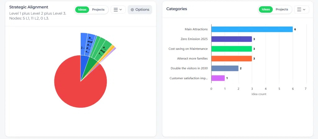
- Strategic Alignment – Distribution of ideas and projects across strategic domains.
- Categories Overview – Idea distribution by category.
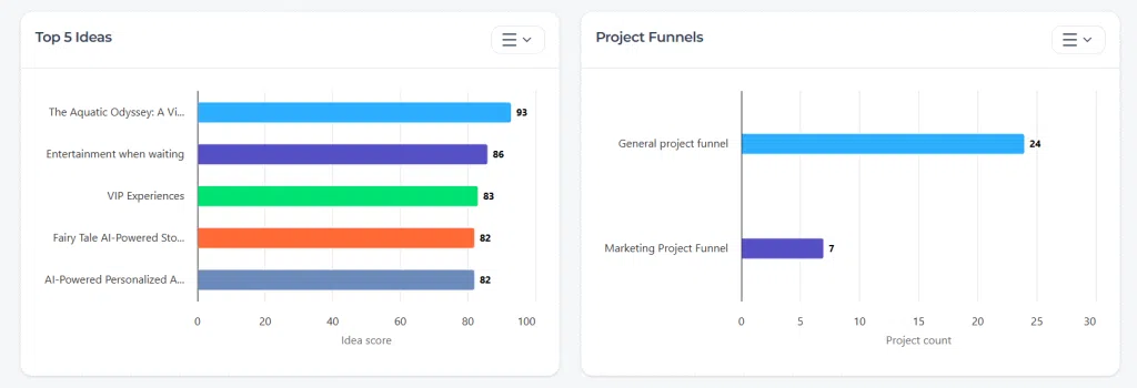
- Top Ideas – Highest scoring ideas in the platform.
- Project Funnels – Project stage distribution.
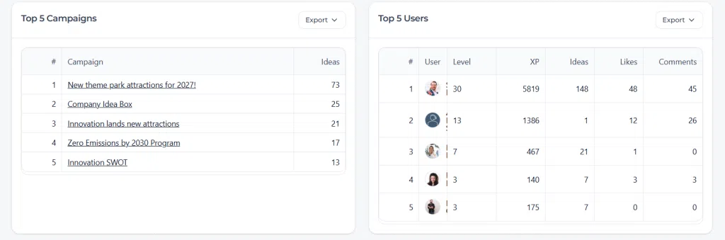
- Top Campaigns – Campaign performance by number of ideas.
- Top Users – User engagement metrics.
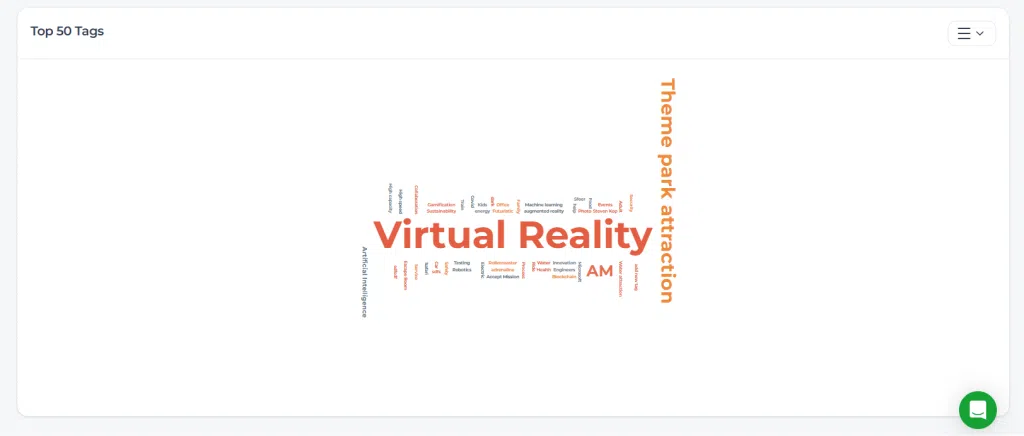
- Top Tags – Trend visualization using tag cloud.
Exporting reports #
Each visualization includes export options. Available export formats may include:
- Print chart
- PNG image
- JPEG image
- PDF document
- SVG vector image
- CSV
- XLS
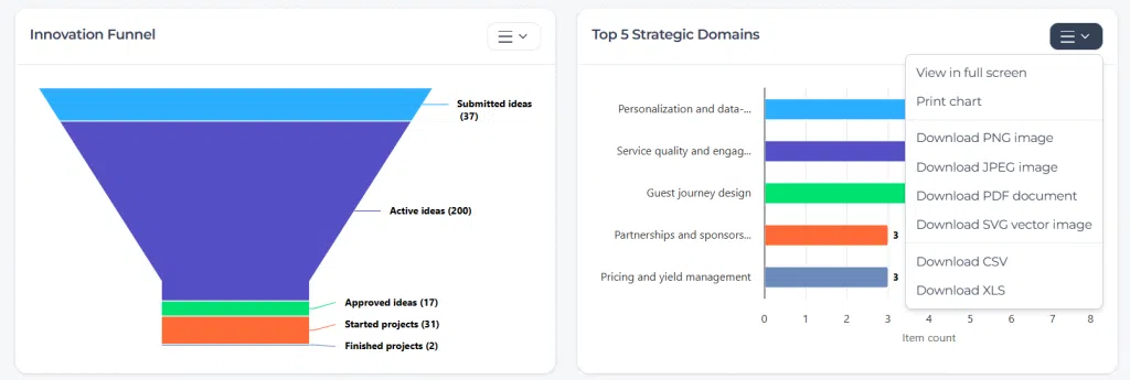
Screenshot: Report export options
Description: The export dropdown menu showing options such as Download PNG image, Download PDF document, Download CSV, and Download XLS.
Step by step instructions #
- Go to Innovation Studio.
- Open Dashboard.
- Select the relevant tab (for example “Overview” or “Project Portfolio”).
- Set the desired Date range.
- Open Filters to refine by department, domain, funnel, or status.
- Review KPI changes and visual reports.
- Use the export menu on any report if you need to share or analyze data externally.
Configuration and adjustments #
The Innovation Dashboard itself does not require configuration. However, its output depends on:
- Funnel configuration
- Scorecards and evaluation logic
- Department and organization structure
- Strategic domain structure
- User roles and participation levels
Changes in these areas directly influence dashboard reporting and comparisons.
Practical example – Innovationlands #
Innovationlands Group uses the Innovation Dashboard to monitor performance across multiple theme parks.
The Group Innovation Board reviews the Overview tab monthly. They filter by “Last 30 days” and compare results with the previous 30-day period. The conversion rate KPI helps them evaluate how many validated ideas progressed into structured projects.
Park Innovation Leads filter by their specific Organization unit to monitor local performance. If Innovationlands World shows a high number of submitted ideas but low approvals, they investigate evaluation bottlenecks in the Idea Funnel.
The Strategic Alignment chart helps the board ensure that initiatives align with strategic pillars such as “Future attractions and innovation” and “Operational excellence and scalability.”
During quarterly reviews, reports are exported as PDF and XLS files to support executive presentations and deeper financial analysis.
Related articles #
- Funnel Reports
- KPI Metrics
- Trend Analysis
- Exporting Data
- Power BI Connector


 English
 Dutch
Dutch Portuguese
 Spanish
 French
 German
 Arabic